Performance Calendar
We all know the expression “content is king.” But if we want to be more specific, we really need to clarify that, on the web, images are king. (As a writer, it pains me to say it, but it’s the truth.)
As internet users, we crave images — the bigger, the better. But as developers, content creators, and site owners, images cause us no end of performance-related angst. According to the latest HTTP Archive data, the average page weighs in at 1795 KB, with 56% of that weight (1000 KB) comprised of images. This makes images arguably the most fertile ground for improving web performance. And this is why, at Radware, we focus so much of our R&D energy on image optimization.
In this post, let’s talk about why images are so immensely valuable, and what we can do to make them as efficient as they are important.
Bigger, better, more. We’re hard-wired to crave images.
Adding images to a page, or making existing images larger, is a proven way to increase conversion rates (the percentage of site visitors who convert to active customers):
For obvious reasons, images aren’t going to go away. But we need to mindful of this…
We’re also extremely sensitive to how images render.
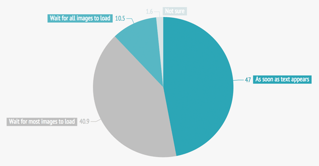
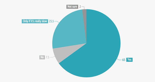
Earlier this year, Radware did some fascinating (if I say so myself) neuroscientific research into how people respond to various image rendering formats in ecommerce transactions. While the focus of our study involved facial action coding and implicit response testing, we also surveyed our 742 test participants to find out what they think about images on the web. Here’s what they told us…
When do you start to interact with a web page?

Have you ever felt frustrated by images taking too long to load?

Some of our other survey findings:
- Around one third of respondents claim that they notice how images load. Only 1 out of 10 think that people don’t notice.
- Around half claim the way images load affects people’s experience of the page, with a further 4 out of 10 claiming people are affected if the images are slow.
- Women are more likely than men to wait for a web page’s images to load before interacting with the page.
The takeaway from this survey is that most people are very sensitive to image rendering. Because of this, we need to do whatever we can to make images as fast as possible for the majority of web users who will delay interacting with a page until images have rendered.
8 things you should be doing (if you’re not already doing them) to improve image performance
You may already be aware of most or all of these practices. But if you are, then you’re in the minority. In surveys performed by Radware and other organizations, most sites fail to fully take advantage of all these techniques.
1. Image compression
Image compression is a performance technique that minimizes the size (in bytes) of a graphics file without degrading the quality of the image to an unacceptable level. Despite the benefits, we’ve found that 43% of the top 100 retail pages failed to implement image compression.
Reducing an image’s file size has two benefits:
- Reducing the amount of time required for images to be sent over the internet or downloaded.
- Increasing the number of images that can be stored in the browser cache, thereby improving page render time on repeat visits to the same page.
2. Reformat images
Inappropriate image formatting is an extremely common performance issue, especially in organizations where you have a lot of content creators with varying degrees of performance know-how dumping images into a CMS. An image that is saved to the wrong format can be several times larger than it would be if saved to the optimal format. Images with unnecessarily high resolution waste bandwidth, processing time, and cache space.
As a general rule of thumb, these are the optimal formats for common image types:
- Photos – JPEG, PNG-24
- Low complexity (few colors) – GIF, PNG-8
- Low complexity with transparency – GIF, PNG-8
- High complexity with transparency – PNG-24
- Line art – SVG
Yes, this is probably all old hat to you. I guarantee that it is not old hat to many people in your organization.
3. Let’s talk WebP
This touches on both compression and format. WebP (which you can read more about on the Google Dev blog) is a new-ish image format that offers lossy and lossless compression for web images. At Radware, we’ve been experimenting with a format — which we’ve dubbed PerfectImage — that takes a lossy compressed WebP image and degrades it until its Structural Similarity (SSIM) Index is 0.985 compared to the original.
4. Spriting
Spriting is a CSS technique for consolidating images. Sprites are simply multiple images combined into a rectilinear grid in one large image. The page fetches the large image all at once as a single CSS background image and then uses CSS background positioning to display the individual component images as needed on the page. This reduces multiple requests to only one, significantly improving performance.
5. Ensure feature images are optimized to load early and quickly
This principle seems like a no-brainer, but it’s amazing how many times I analyze pages that load primary content last. Site owners should be aware of the usability consequence of delaying the rendering of feature content: according to this Nielsen Norman Group eyetracking study, a user who experiences instantaneous page rendering spends 20% of their viewing time within the feature area of a page, whereas a user who endures an eight-second download delay spends only 1% of their total viewing time looking at the featured space on a page.
![]()
6. Defer non-essential images (an obvious corollary to #5)
Help your visitors see the page faster by delaying the loading and rendering of any images that are below the initially visible area (sometimes called “below the fold”). Deferring non-essential content won’t change your bottom-line load time, but it can dramatically improve your perceived load time.
7. Auto-preloading (AKA predictive browser caching)
Not to be confused with browser preloading, auto-preloading is a powerful performance technique in which all user paths through a website are observed and recorded. Based on this massive amount of aggregated data, the auto-preloading engine can predict where a user is likely to go based on the page they are currently on and the previous pages in their path. The engine loads the resources (i.e. images) for those “next” pages in the user’s browser cache, enabling the page to render up to 70% faster.
(Note that this is necessarily a data-intensive, highly dynamic technique that can only be performed by an automated solution. Learn more about auto-preloading.)
8. Make the perceived value worth the wait
I can handle waiting for a slow image that is either entertaining or offers important information. But waiting extra seconds just to see a stock image render makes me feel like chump for wasting my time. Images should always, always, always offer value to the user. If they don’t, they’re performance dead wood and should be pruned.
Takeaway
Tackling images is one of the easiest ways I can think of to pluck the low-hanging performance fruit. As I said earlier in this post, most or all of these techniques may be very familiar to you. But if your organization has a large number of content creators who are responsible for generating and uploading images to your CMS, I can guarantee that they will not be familiar with them. In the new year, consider making it your mission to spread the gospel of image optimization throughout your organization.