Aerotwist - Pixels are expensive
The other day I was reading through What Every Frontend Developer Should Know About Webpage Rendering and I came away feeling like it missed out some crucial points. The article emphasizes CSS selector matching, layout (or reflow for Gecko-based browsers like Firefox), and being careful about forced synchronous layouts aka Layout Thrashing. All of these things, I should say, are good things for us to be aware of, but for me it doesn’t cover everything we need to know about page rendering. For the most part we’ll be trying to get to 60fps in our work, and that normally means understanding what the browser’s doing and optimizing for it.
I did a session at this year’s Google I/O where I step through the pipeline in a fair amount of detail. If you prefer watching over reading then here’s the session video:
The render pipeline part starts around 16 minutes in, in case you want to skip to it.
What Developers Need To Know About Webpage Rendering
From a developer’s point of view there are four major areas we care about:
1. Recalculate Style
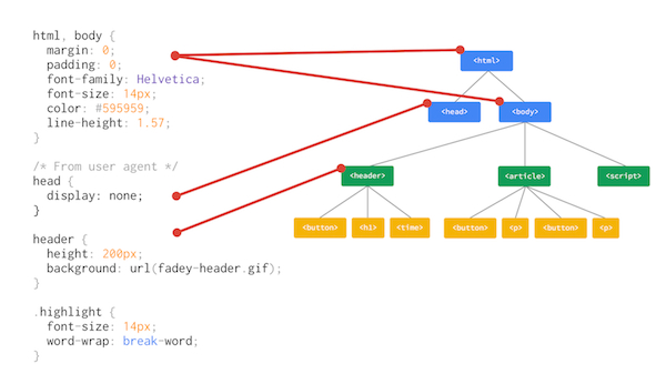
This is the first part that the article looked at, and it pertains to selector matching and figuring out which styles apply to which parts of the DOM.

Normally, however, this is super fast unless you have a DOM tree with thousands upon thousands of elements and you invalidate a large part of the tree (like – say – by adding a class to the body that affects all its children).
For the most part optimizing selector matching is going to give minimal returns.
For the most part optimizing selector matching is going to give minimal returns. Not when you factor in what happens next…
2. Layout
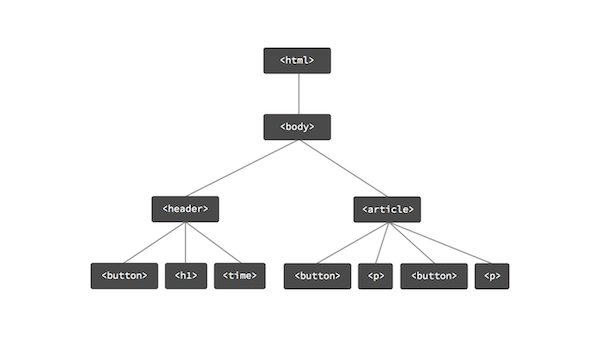
Once we know what styles apply to the DOM we have a render tree, which is what we want to paint. To us it looks essentially like the DOM with things missing (the stuff we don’t need to draw) and other things added (like pseudo elements).

If I change the dimensions of
<body>, then chances are the things inside of it will also need to change.
In layout we figure out the geometry of the page, i.e. where is each element on the page? This is where things can start to get a little more computationally expensive as the way elements are laid out is contingent; where one element lives is normally in relation to another. If I change the dimensions of <body>, then chances are the things inside of it will also need to change.
Now this is also where things get interesting. Let’s say you change a layout property, something that alters the geometry of the page (paddings, margins, positions, text size, borders), what happens then? Well here’s a video I made that shows the Chrome DevTools Timeline when you alter the geometry of an element. In this case I change its height:
The thing to notice is that the bars are shooting way past the 60fps line, and that we spend around ~23ms figuring out the geometry changes in each frame. This is true whether the animation is triggered by JavaScript or CSS as the layout work still needs to get done. When we’re aiming to achieve 60fps we have ~16ms to get everything done, and we just went over that in one task. Oops.
As something of a bonus point here, you definitely want to avoid layout thrashing, or forced synchronous layouts, which is where you cause a browser to do layout / reflows unnecessarily. That’s just going to make matters even worse.
With that said, however, from that video you’ll hopefully also see that although we spend ~23ms in layout we spend a whopping ~600ms painting the changed pixels.
3. Paint
Now we know where the elements are we need to fill in their pixels, and this is where you’re going to spend the vast majority of your time. If you trigger paint you’re going to feel it. Well, your users definitely will when your site struggles along. Here’s another sample where I cause paints (no layout changes here) by changing an element from gray to glorious hot pink:
The kinds of properties that trigger paint are color, background or shadows, but really if you change a layout property you are going to trigger paint. The geometry of the page changed, so the pixels were dirtied and need to be fixed.
Once we’re done painting we are on to the final part.
4. Composite
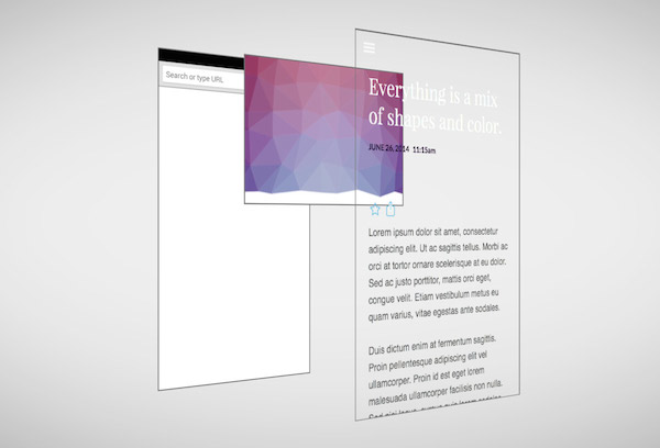
We sometimes separate elements out into distinct layers, called compositor layers.
By default we paint elements into a single layer in memory, which for us as developers we can think of in a similar way to Photoshop’s canvas. If you change a pixel with a brush it’s destructive, you can’t get back at the original pixels. (There’s an undo in Photoshop… L.O.L.)
To get around this problem, in a very similar way to Photoshop and other art packages, we sometimes separate elements out into distinct layers, called compositor layers. That way if we have to paint an element ideally we don’t want to have to paint anything else. I’ve written about the rules that are currently in use for ‘promoting’ an element to its own layer before, but stick around as there’s a totally new way, which I will explain shortly! :-O

When we’re done with these layers we smush them all back together, which is compositing.
Avoiding performance bottlenecks
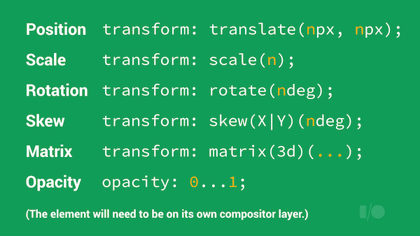
A while back I wrote an article with Paul Irish on HTML5 Rocks explaining how you can get high performance animations, or in this case, how you can exploit the pipeline to make sure you hit 60fps. What it boils down to is only changing properties that trigger compositing rather than layout or paint:

This is the list of the most common transforms, along with opacity, but in theory it should work for any of them. You will need to put elements onto their own compositor layer, though. The newest and shiniest way of doing that is will-change, which, for certain keywords, like opacity or transform will cause Chrome and Firefox to make the appropriate optimizations under the hood. In the case of these two keywords, for Chrome at least, means making compositor layers.
If you’re new to will-change, Sara Soueidan recently wrote up a post about it on dev.Opera. If you can’t rely on that for your work, and that includes the current version of Chrome, then you’re talking old skool hacks like -webkit-backface-visibility: hidden or the perennial fave, -webkit-transform: translateZ(0); (ohai null transform layer hack!), and you’ll be on your way again.
When we stick to compositor operations, we see super light frames and we get 60fps!
For the curious, the reason that we see transparent frames is because we’re still tracking to 60fps, even if the workload completes earlier than 16ms. In those cases we fill the Timeline bars with empty space. Ooh space!
Tools, Not Rules and a brighter future
Things are always changing, including the pipeline I’ve explained. The thoroughly spiffing news is that your developer tools will always be up-to-date and truthy, so if you’re not used to spending a lot of huggle time, all-up-n-cosy with your tools, change that. They’ll love you back.
The really good news is that things are also getting much faster. At this year’s Google I/O we showed fast, fluid, continous animations at 60fps in Chrome on Android, and that’s something that continues to be really important to the Chrome team. I know it’s also really important for other browser vendors, too.
I hope to some day say that all you need to care about is writing ‘sane’ code, whether it triggers layout, paint or anything else, and that you can let the browser do the work, but until then, this is what every frontend developer should know about webpage rendering.