Tricks for GPU Composited CSS

The use of graphics processing unit (GPU) in modern browsers, particularly for page rendering, means that there is no more excuse for laggy animation. In some cases, when the intended animation is not necessarily GPU friendly, some tricks need to be employed so that the graphics operations do not cause a potential performance problem.
The fundamental principles of exploiting GPU for popular CSS features have been described in my previous blog post on Optimizing CSS3 for GPU Compositing. The key here is the compositing process where the browser uploads portions of the page as GPU textures and subsequent animation frames involve only a small set of operations on those textures. The current modern browser rendering engines allow a few different operations to delegated to its GPU-compositor: opacity, transformation, and filter.
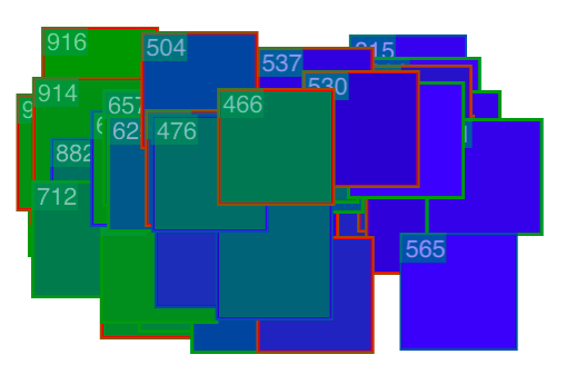
Still, for a buttery smooth 60 fps interface, web developers need to ensure that certain rendering operations are GPU friendly. As mentioned in my previous blog post, an easy way to verify that is by using Safari’s Show Compositing Border feature. The number on the top left corner for each rectangle represents more or less every content update operation which necessites a texture upload to the GPU. Efficient compositing is indicated by having that number unchanged during the course of the animation.
What about animations that are not easily handled by the compositor? Let’s take a look at the following example (also check the live demo at codepen.io/ariya/full/xuwgy):
@keyframes box { 0% { background-color: green; } 100% { background-color: blue; } } |

For clarity, the box is also moving horizontally back and forth. When it is on the left, the color is green and as it moves to the right, the color also changes to blue. Safari (with its compositing border indicator enabled) reveals that there is a continuous rendering of the box onto a GPU texture. With more boxes, while viewing it on a mobile device, the animation will cause frame-dropping or even an application crash.
To overcome this issue, we need to find a trick where a continous texture update is avoided. In the simple color transition example above, we are lucky since we can opt to use CSS filter instead. However, if assume we can’t or won’t be using it, what would be a more generalized approach? Apparently, for such an animation with a short duration and thus the accuracy is not a big concern, we can always approximate it by superimposing two states, each represents the initial and the final state, and tween the opacity accordingly. To get the feeling of it, check out the demo at codepen.io/ariya/full/ofDIh.
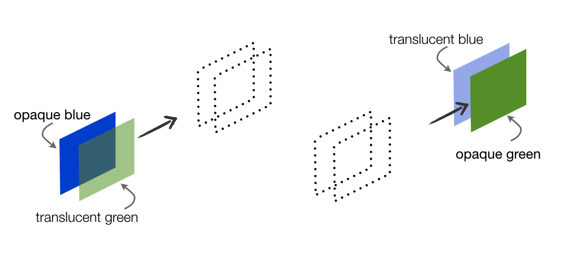
In this arrangement, the user has the illusion that the box changes color. What actually happens is that the green box starts to disappear when the blue one slowly appears. Since changing the opacity is a very cheap operation for the GPU, the animation will be smooth. The following diagram shows the magic behind the scene. Viewed from a user facing north west, it is as if there is only one opaque box with a gradual color transition.

This technique can be applied to other properties as well. For example, take a look at this glowing effect: codepen.io/ariya/full/nFADe. While glowing can be achieved by varying the blur radius of the shadow, tweening between the glowing version and non-glowing version is our kind of cheat with this trick. Less accurate, more shortcut.
As with any other types of workaround, the opacity tweening trick has some drawbacks. Most important is that it requires more memory since we trade it for a fast animation frame. Thus, be judious in employing the trick since you can’t blindly consume all the available GPU textures for user interface animations.
Last but not least, if you prefer to watch a video on this subject, take a look my past presentation on Fluid User Interface with Hardware Acceleration (28-min video, slide deck).