Designer's guide to DPI
DPI or Dots Per Inch is a measure of spatial dot density initially used in print. It's the number of ink drops your printer can put in an inch . A smaller DPI yields a less-detailed image.
This concept is applied to computer screens under the name PPI for Pixels Per Inch. Same principle: It counts the number of pixels your screen can display per inch. The name DPI is also used in screens.
Windows computers have a default PPI of 96. Mac uses 72, although this value hasn't been accurate since the 80's.
Regular, non-retina desktops (mac included) will have a PPI of 72 minimum up to around 120 maximum.
Designing with a PPI between 72 and 120 ensures your work is going to be roughly the same size ratio everywhere.
Here’s an applied example:
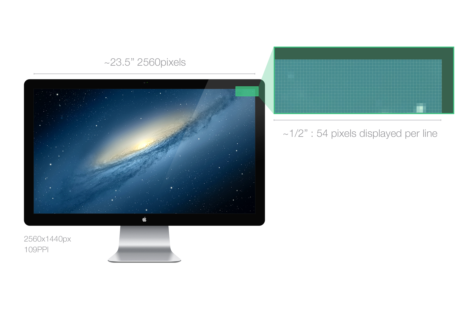
A Mac Cinema Display 27” has a PPI of 109, which means that it displays 109 pixels per inch of screen.
The width with bevel is 25.7 inches (65cm). The width of the actual screen is approximately 23.5 inches so
23.5*109~2560, which makes the native screen resolution 2560x1440px.
*I know that 23.5*109 does not equal exactly 2560. It’s actually 23.486238532 inches. It would be more precise with pixels per centimeters, but you get the idea.
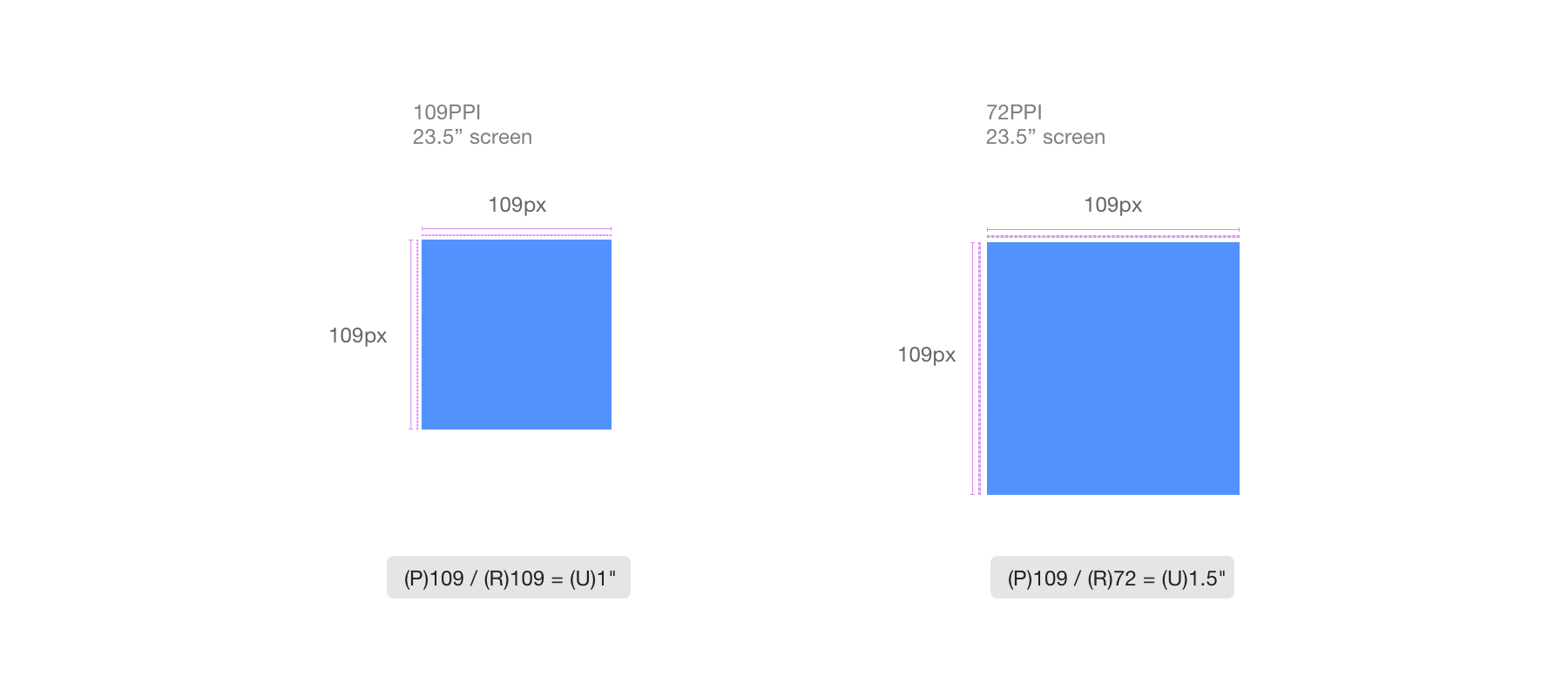
Let’s say you design a blue square of 109*109px on the screen we just talked about above.
This square will have a physical size on the screen of 1*1 inch. But if your user has a screen with a PPI of 72, your blue square will appear physically bigger. Since the PPI is 72, the screen will need aproximately an inch and a half to display your blue square of 109px. See a simulation of the effect below.
Takeaway
Leaving color and resolution differences aside, keep in mind that everybody will see your design differently. You should aim for the best compromise and hit the largest percentage of users. Do not assume that the user has a screen similar and as good as yours.
Screen resolution can have a huge impact on how the user perceives your design. Thankfully, since LCD monitors have replaced CRT ones, users now tend to have native screen resolutions that guarantee a good screen size/PPI ratio.
The resolution defines the number of pixels displayed on the screen (ex: 2560*1440px for the cinema display 27in.) 2560 is the width, 1440 is the height. Of course now that you know what PPI means, you understand that this can’t be an unit of measure of a physical size. You can have a 2560x1440 screen the size of your wall and another one the size of your head.
Today’s LCD monitors have a pre-defined default or native resolution that will handle the exact number of pixels that the screen is able to display. It was slightly different with old CRT monitors, but since those can be considered dead, let’s not enter into the details (and not reveal my only partial understanding of the good old TV).
Let’s take our 27” Cinema Display that can display 109 PPI at a native resolution of 2560*1440px. If you reduce the resolution, the elements will appear bigger. After all you’ll have 23.5 horizontal inches to fill with virtually less pixels.

I said virtually because in this case it will be. The screen has a native resolution of 2560*1440px. If the resolution goes down, the pixels are still here, displayed in 109PPI. What your OS will do to fill the gap and fill the entire screen is stretch everything. Your GPU/CPU will take every pixels and calculate them with the new ratio.
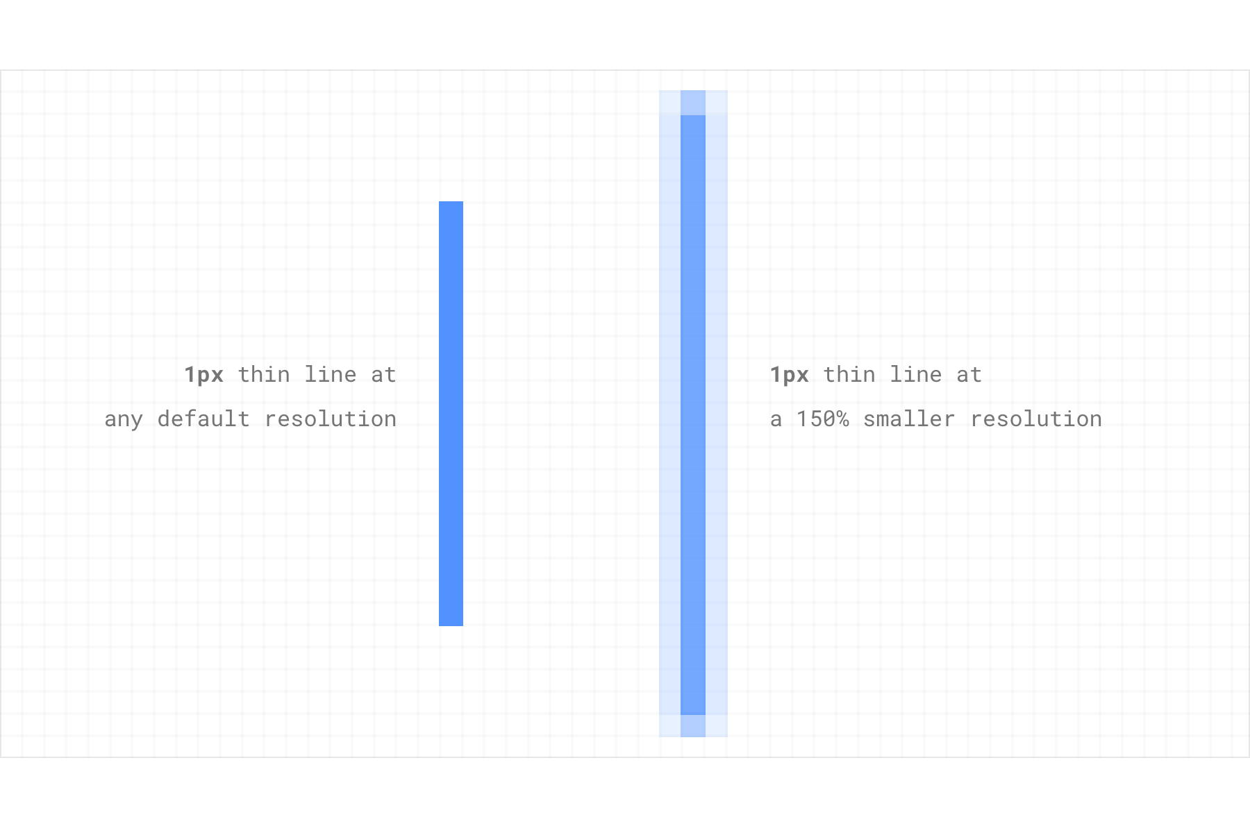
If you want the resolution to be 1280*720 (half the width, half the height as before) on your 27", then your GPU will have to simulate a pixel that is twice as big to fill the screen. What will the result be ? Well, blur. While half the ratio will look fairly ok because of the simple divider, if you ask for 1/3 or 3/4 of the ratio then you’ll end up with decimal numbers, and you CANNOT divide a pixel. See example below.
Consider the other example below. Take a 1px line on a native resolution screen. Now apply a resolution 50% smaller. To fill the screen the CPU will have to generate the visuals at 150%, multiplying everything by 1.5. 1*1.5=1.5, but you can't have half pixels. What will happen is that it will fill the surrounding pixels by a fraction of the color, creating blur.
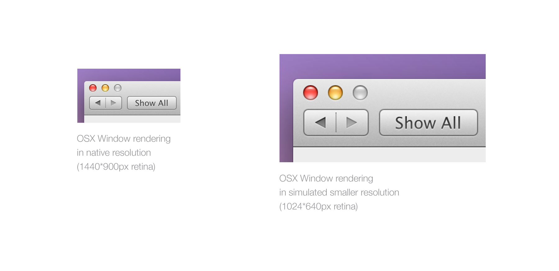
That’s why if you have a Retina Macbook Pro and want to change your resolution, it will display the window below, letting you know that (in the screenshot below) this resolution will “look like” 1280*800px. It uses the user's resolution experience to express a size ratio.
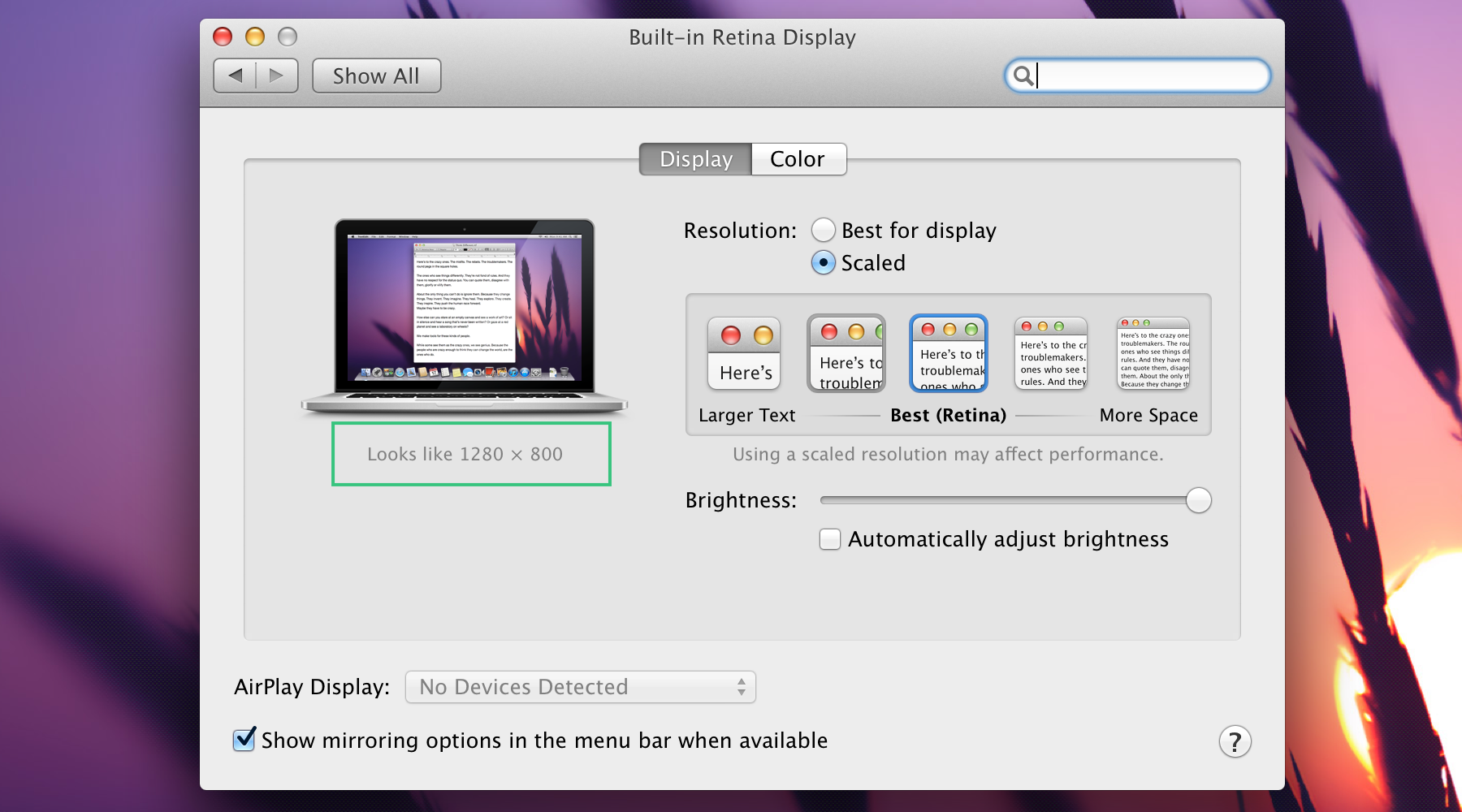
This is a highly subjective representation because it’s using a pixel resolution as a unit of physical size, but it is not a lie, at least from their standpoint.
Takeaway:
If you want to always see your design (or any design) pixel-perfect, never use a resolution different from your native one. Yes you may be more comfortable with a smaller ratio but when it comes to pixels, you want to be as accurate as possible.
Unfortunately, some people use the resolution as a way to see better what’s on the screen (especially on desktop) when they should be using accessibility settings. That will still make your design look bad, but at that point users are looking for enhanced legibility, not polish.
You may have heard the term 4K a lot lately (at least when I wrote this, beginning of 2014), 4k is quite a trendy subject. To understand what is is let's first understand what "HD" means.
Careful, this is an ultra-simplification. I'm only going to talk about the most common resolutions.
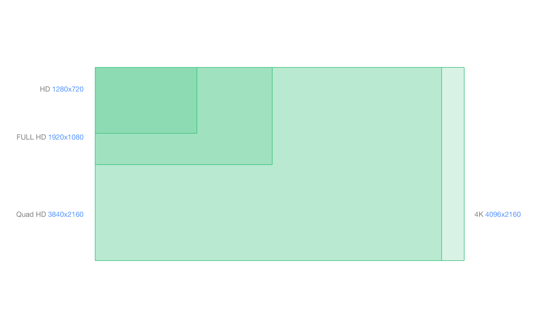
There is different categories of HD.
The term HD is applicable to any resolution starting from 1280x720px or 720p for 720 horizontal lines. Some may also call this resolution SD for standard definition
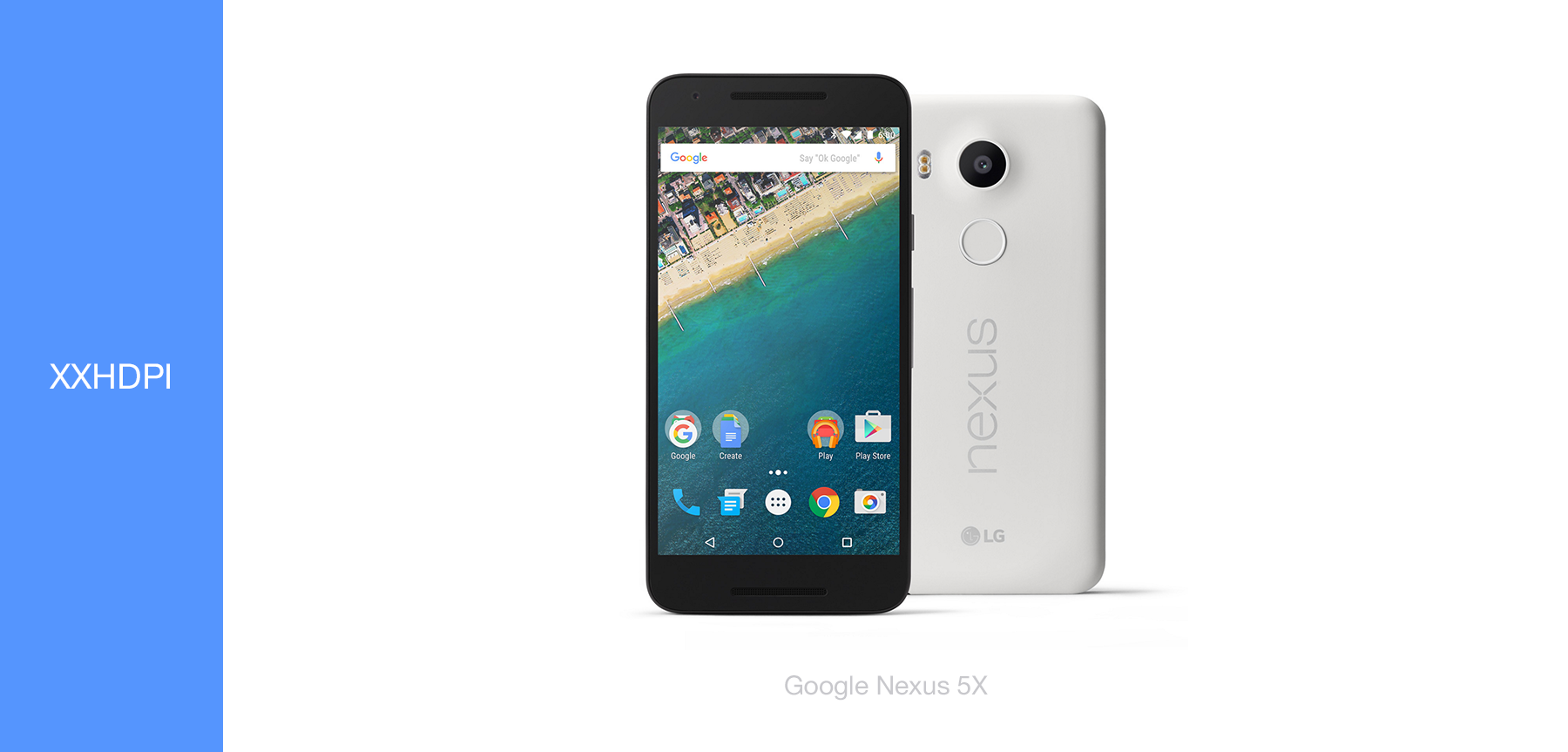
The term full HD applies to the 1920x1080px screens. Most TVs uses this resolution and more and more high end phones (Galaxy SIV, HTC one, Sony Xperia Z, Nexus5)
4K starts at 3840x2160 pixels. It was also call Quad HD and can be referred to as UHD for Ultra HD. Simply put, you can put 4 1080p in a 4K screen in term of number of pixels.
Another resolution of 4K is 4096x2160. It's slightly larger and used for projectors and professional cameras.
What happens if I plug a 4K display to my computer
Current OS do not scale 4K, it means that if you plug a 4K display to a Chromebook or a macbook, it will use the highest DPI asset, in this case the 200% or @2x ones, and display them at normal ratio, making everything look good but tiny.
Hypothetical example: If you plug a 12" 4K screen to a computer with a 12" hi-res screen (2x), everything will appear twice as small.
Takeaway:
- 4k is 4 times Full HD.
- If current OS handles 4K but do not scale it, meaning no 4K specific assets yet.
- No phone or tablet uses 4K as of today.
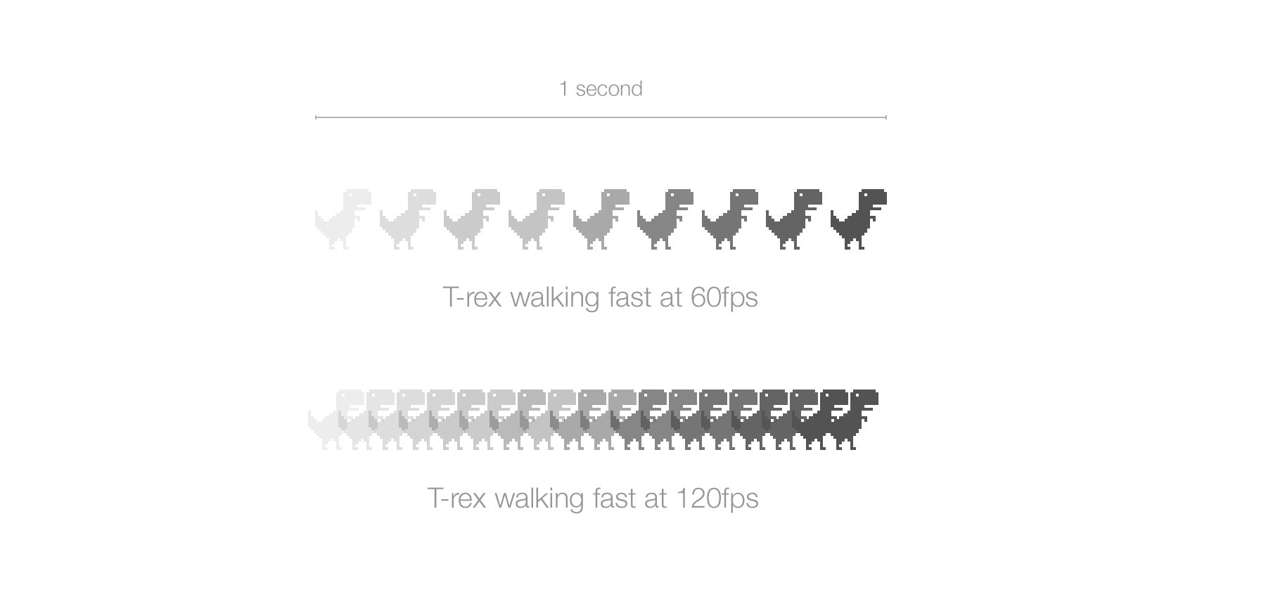
A little break from the PPI and screen resolution here for a quick note. You might have seen that close to the resolution settings for your screen there is the monitor Hz value. This has nothing to do with PPI, but just in case you’re wondering, the monitor Hertz - or refresh rate - is the unit of speed at which your monitor will display a fixed image or frame, per second. A monitor with 60Hz will be able to display 60 frame per second. A monitor of 120Hz, 120fps etc…
In the context of an UI, monitor Hertz(Hz) will define how smooth and detailed your animation will look. Most screens are 60Hz. Note that the number of frames displayed per second is also dependent on the device's processing and graphical power. Adapting a 120Hz screen on an Atari 2600 would be quite useless.
To better understand, look at the example below. the T-rex goes to point A to point B at a fast and exactly equal pace on both a 60Hz and 120Hz screen. The 60fps screen is able to display 9 frames during the animation while the 120fps logically displays twice as more frame in the same fraction of time. The animation will appear much smoother on the 120Hz screen.
Takeaway:
Some people might say that the human eye can’t see above 60fps. This is wrong. Don’t listen and walk away while laughing in the most obnoxious way possible.
The naming of “Retina display” was introduced by Apple for the iPhone 4 release. It’s called Retina because the PPI of the device was so high that the human's retina was supposedly not able to distinguish the pixels on the screens.
This statement is true for the range of devices' screen size it's used in, but as the screens are getting better and better, our eyes are now trained enough to perceive the pixels - especially for rounded UI elements.
Technically, What they did is display twice as many pixels in height and width in the exact same physical size.
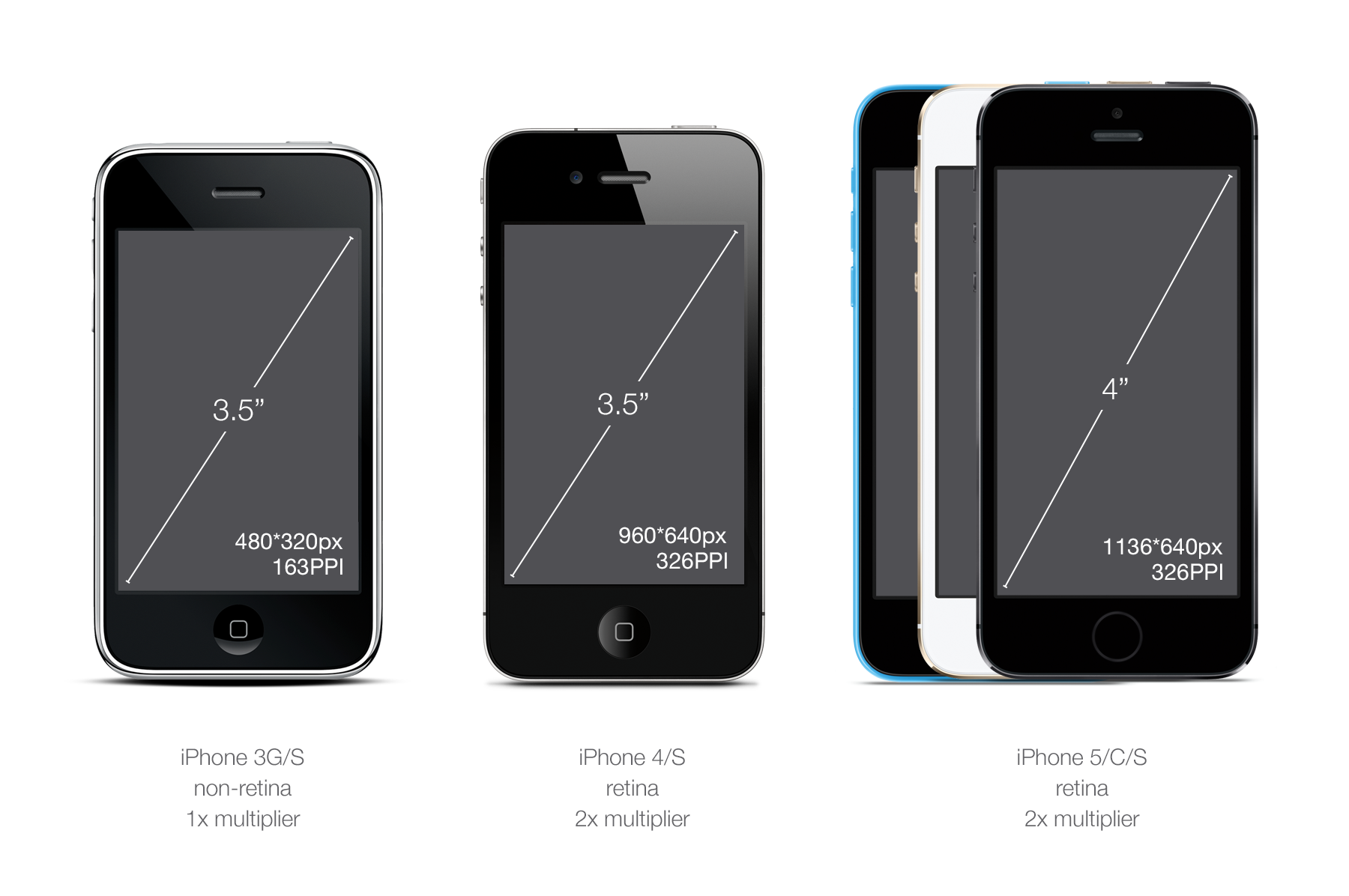
The iPhone 3G/S was 3.5 inch diagonal with a resolution of 480*320px which makes 163PPI.
The iPhone 4/S was 3.5 inch diagonal with a resolution of 960*640px which makes 326PPI.
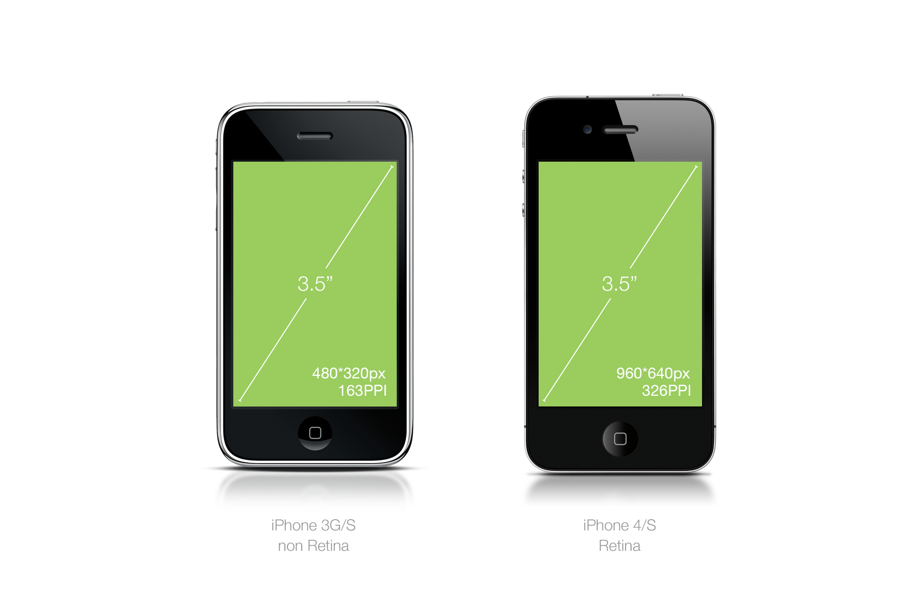
BOOM! Exactly twice. An easy multiplier. So instead of being smaller, the elements on the screen are twice as visually sharp because they have twice as many pixels and are exactly the same physical size. A single 1 normal pixel = 4 retina pixels, four times as many pixels.
Consider the example below for direct application in a complex design.
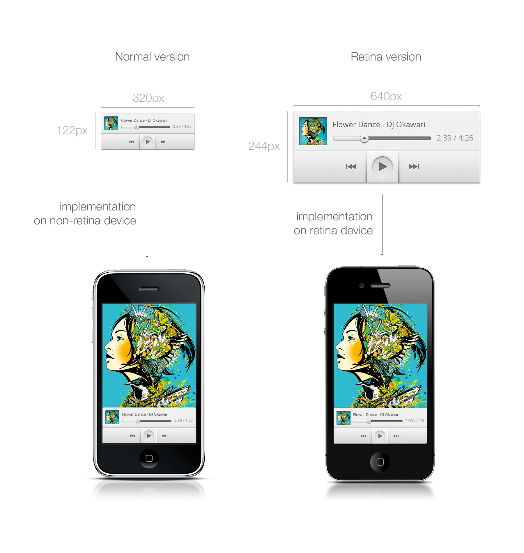
Image note: It is hard to simulate different image quality from two devices on a third device, i.e. the one you are looking at right now. For the retina music player above, even while taking the exact same physical space, image quality will look twice as nice and sharp on the iPhone 4. If you want to check it out locally, I used one of my freebies for the purpose of this demonstration and you can download the source.
"Retina" display naming is owned by Apple so other companies will use "HI-DPI" or “Super power pixel maximum sp33d display” (I'm going to trademark the latter) or nothing at all. It’ll up to you while reading device spec to figure out what’s the DPI and screen size (how fun.)
Takeaway:
Apple products are an excellent way to get familiar with DPI conversion and to understand the differences between resolution, PPI and physical size ratio because you’ll only have to worry about 1 multiplier.
The multiplier is your mathematical savior when it comes to converting your design for all the different PPIs. When you know the multiplier, you don't have to care about the detailed specs of the device anymore.
Let’s take our iPhone 3G and 4 example. You have twice as many pixels in the same physical size. Therefore your multiplier is 2. It means that to make your assets compatible with the 4G resolution, you just have to multiply your assets size by 2 and you’ll be done.
Let's say you create a 44*44px button which is the recommended touch target by iOS (I'll talk about that later). Let’s call him by a typical button name like "Jim."
To make Jim look good on the iPhone 4 you're going to have to create a twice-as-large version of him. That's what we're doing below.
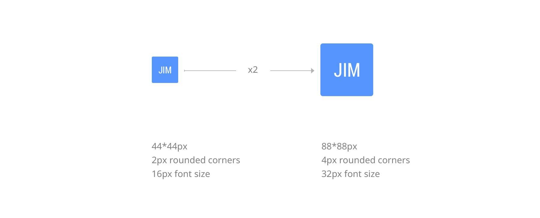
Pretty simple. Now Jim has a Jim.png version for the normal PPI (iPhone 3) and a Jim@2x.png version for the 200% PPI (iPhone 4.)
Now you may ask, “But wait! I’m pretty sure there are other multipliers beyond just two.” There are, and that’s where it becomes a nightmare. OK, maybe not a nightmare, but I’m pretty sure you’d prefer spending a day ironing your socks then handling a gazillion multipliers. Thankfully it is not as terrible as you think, we'll get to that later.
Let's talk units first because now you are going to need an unit other than pixel to spec your multi-DPI designs. That's where DP and PT comes in.
Takeaway:
The multiplier is what you need to know for every design you’re working on. Multipliers are what hold together this world of chaos that is screen size and PPI and make it understandable to humans.
DP or PT is the unit of measure you can use to spec out your multi-device, multi-DPI app mock-ups.
DP or DiP stands for Device independent Pixel and PT for Point. PT is an Apple thing; DP is an Android thing, but they are essentially the same.
In short, it will define a size independently of the device multiplier. This helps a lot while discussing a spec between different actors like the designer and the engineer.
Let's take our previous button example, "Jim."
Jim has a 44px width on normal non-retina screens and a 88px width for retina screens. Let’s get technical and add a padding around Jim of 20px because he likes having his space. The padding will then be 40px for retina. But it really doesn’t make sense to count retina pixels when you’re designing on a non-retina screen.
So what we’re going to do is take a normal 100% non-retina ratio as the base of everything.
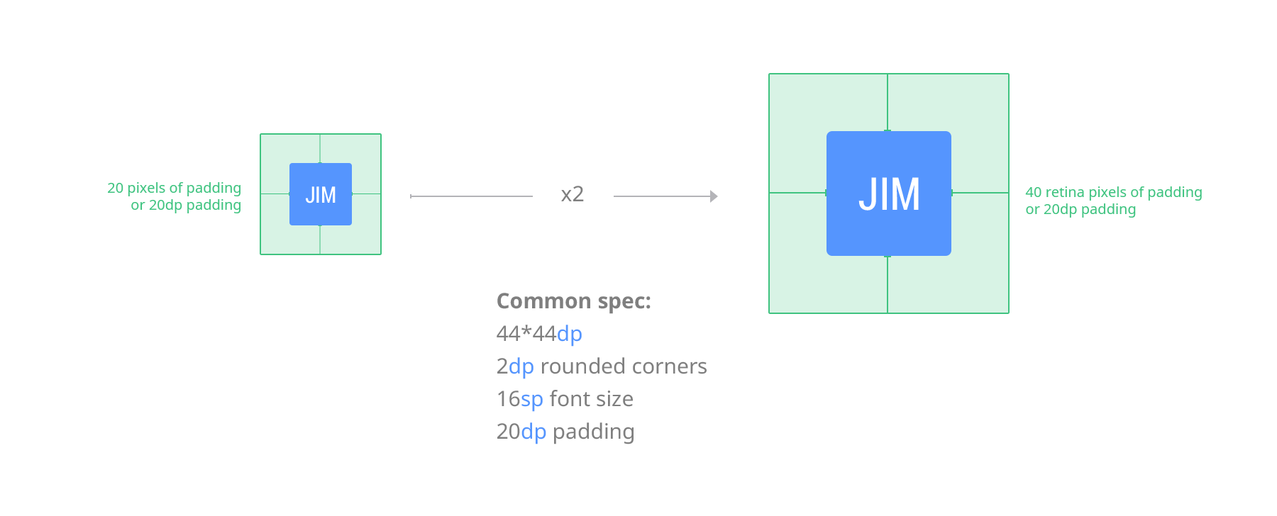
In this case Jim will have a size of 44*44DP or PT and a padding of 20DP or PT. You can deliver your spec in any PPI, Jim will still be 44*44dp or pt.
Android and iOS will adapt this size to the screen and convert with the right multiplier. That’s why I find it easier to always design using the default PPI of your screen.
SP is separated from DP and PT by it's usage but works the same way. SP stands for Scale-independent pixels and is used to define font sizes. The SP will be influenced by the user font settings on their Android devices. As a designer, defining the SP is like defining a DP for anything else. Base it on what's legible at 1x scale (16sp for example, is a great font size for readibility).
Takeaway:
Always use resolution/scale-independent values when specing. Always. The more varied the screen size/resolution are, the more it becomes essential.
Now That you know what PPI, retina and a multiplier is, it is important to talk about something that have been asked to me quite a bit and is quite confusing: "What happens if I change the PPI configuration in my design tool ?"
If you asked yourself this question, that means that you are a bit familiar with design software. Now here is something extremely important to understand that took me a while:
Anything non-print uses pixel sizes regardless of the initial PPI configuration.
PPI configuration in software is a printing legacy. If you design only for the web, PPI won't have any influense on the size of your bitmap.
This is why we use multipliers and not direct PPI value. Your canvas and graphics will always be converted to pixel by the software using the corresponding multiplier.
Here's an example. You can try it yourself with a program that allows PPI configuration, like Photoshop. I drew a 80*80px square and a text with a size of 16pt in photoshop with a configuration of 72PPI. The second one is the same thing with a 144PPI configuration.
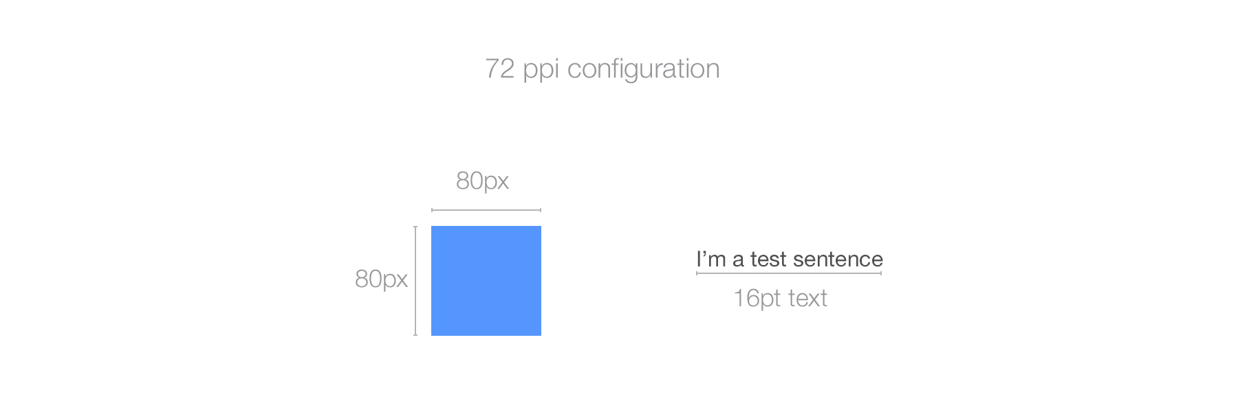
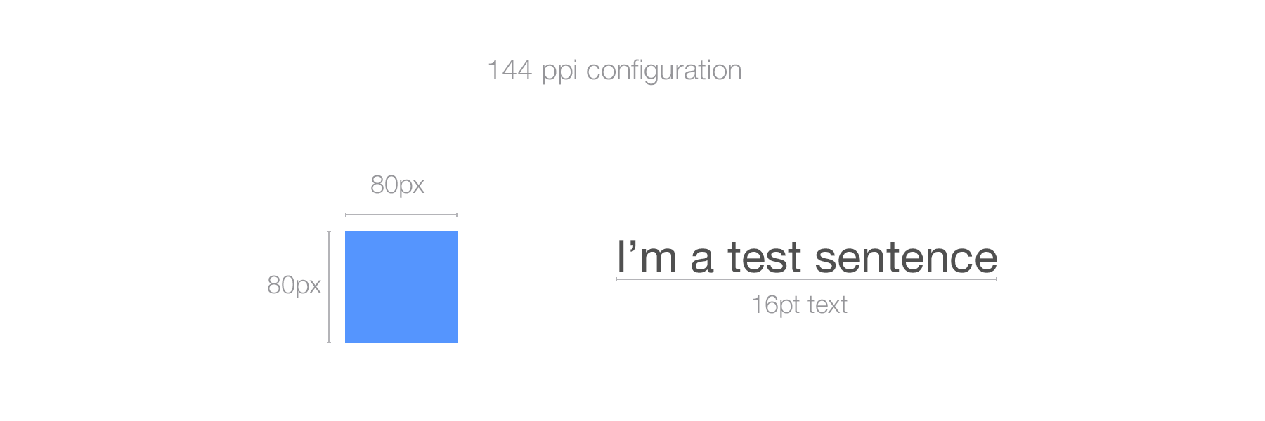
As you can see, the text got quite bigger, twice bigger to be exact while the square remained the same. The reason for that is that the program (Photoshop in this case) scales the pt values (as it should) based on the PPI value, resulting in doubling the rendering size of the text on the doubled PPI configuration. On the other hand, what has been defined using pixel, i.e, the blue square shape, remains the exact same size. A pixel is a pixel and will stay a pixel whatever the PPI configuration. What will make it different is the PPI of the screen that displays it.
What is important to remember is that when designing for digital, the PPI will only have an incidence on how you perceive your design and on your workflow and on pt sized graphics such as font. If you include in your workflow source files with various PPI configurations, the program will resize any transferred visual between the different files by the PPI ratio of the receiving file. It will be come a problem for you.
The solution ? Use a PPI (preferably in the 72-120 range for 1x design) and stick to it. I personnaly use 72PPI because it's the default configuration in Photoshop and most of my co-workers do the same.
Takeaway:
- PPI configuration doesn't have any influence when exporting for the web.
- PPI configuration will only have influence on graphics generated based on PPI-independent measurement such as PT
- Pixel is the unit of measure for anything digital.
- Keep the multipliers in mind and what you are designing for, not the PPI.
- Use a realistic PPI configuration when designing for digital, something that gives you a sense of what it's going to look like on the targeted device (72-120ppi for 1x web/desktop for example).
- Keep the same PPI configuration thoughout your files.
Additional reading on that on this very interesting StackExchange post.
Time to dive into platform-specific design.
Let's take a little tour of what devices iOS has as of the start of 2014.
When it comes to screen size and DPI, iOS has 2 types of mobile devices and 2 types of laptop/desktop screens.
On mobile, they have the iPhone, of course, and the iPad.
In the phone category, you have the old 3GS (still supported on iOS6) and up. Only the iPhone 3GS is non-retina. iPhone 5 and up use a taller screen with the same DPI as the iPhone 4 and 4s. See cheatsheet below:
Then you have the iPod touch category. Consider them as iPhones when it comes to design. iPod 4th gen and down are using iOS6 and are non-retina. iPod 5th gen and up are using retina screens and are compatible with iOS7. Screen-wise iPod 5th gen is using an iPhone 5-sized screen.
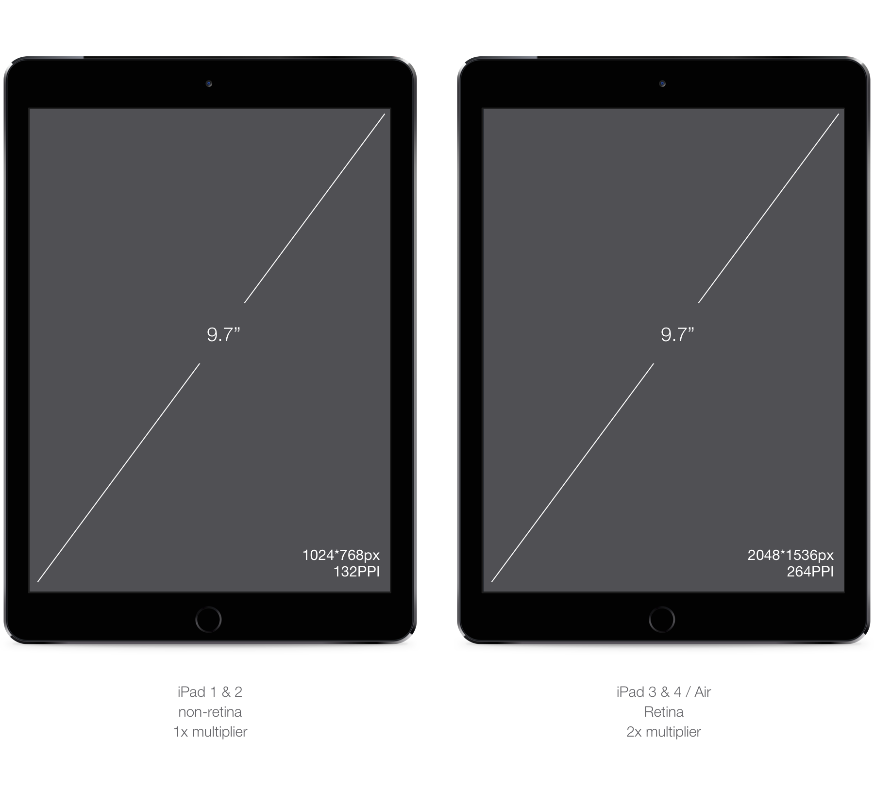
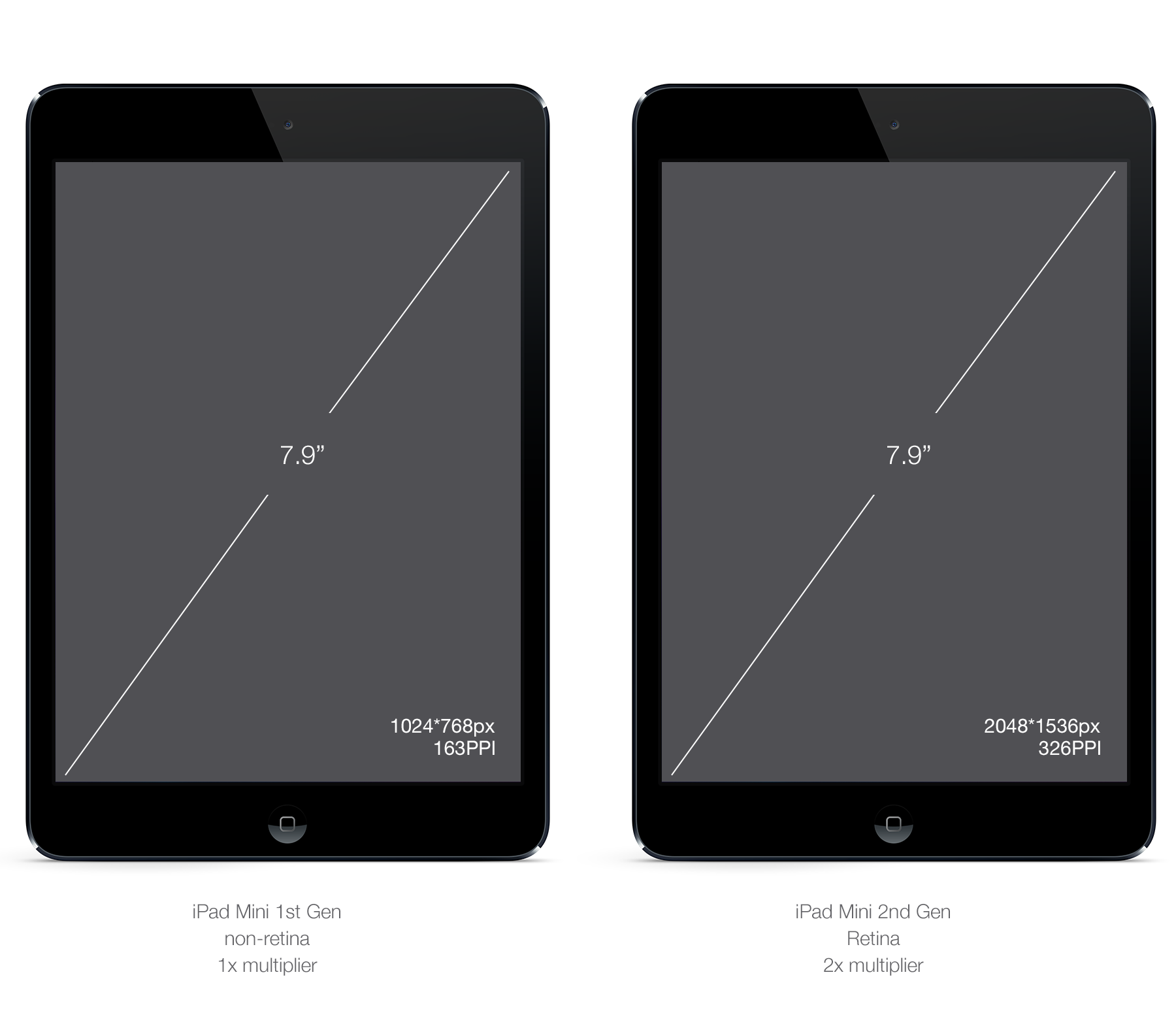
Finally you have the iPads. With the exception of iPad 1st gen (out-of-date today,) they all use iOS7, and only the iPad2 and iPad mini 1st Gen uses a non-retina screen. If you're wondering what an iPad mini is from a design standpoint, it's a regular iPad (same PPI screen), but physically smaller. By this I mean that they took the same resolution and reduced it from 9.7in to 7.9in. Keeping the same ratio and therefore increasing the pixel density. Your visual assets will appear slightly smaller.
Regarding the desktop/laptop category, we're not going to be covering every single screen sizes Apple offers. As of today, Apple offers most of its screens in 1x multiplier (Macbook, Macbook Air, old Macbook Pros, desktop screens.) Retina exists in 13 and 15" for Macbook Pros only. The multiplier is 2x, exactly like iPads and iPhones. If designing for desktop is different than mobile, you'll produce assets the same way to cover the 2 different types of screens.
With only one multiplier, creating assets for iOS and OSX is pretty straightforward. I suggest to start designing for the base PPI (i.e 100%/1x) and multiply by 2 afterwards to proof you design on a @2x screen and generate the @2x assets. Once you are more comfortable with switching back and forth between 1x and 2x, you'll be able to design directly in @2x, scaling down your assets for lower resolution. This will be particularly helpful if you are designing on a retina screen (Macbook pro).
Required Assets, Chrome example.
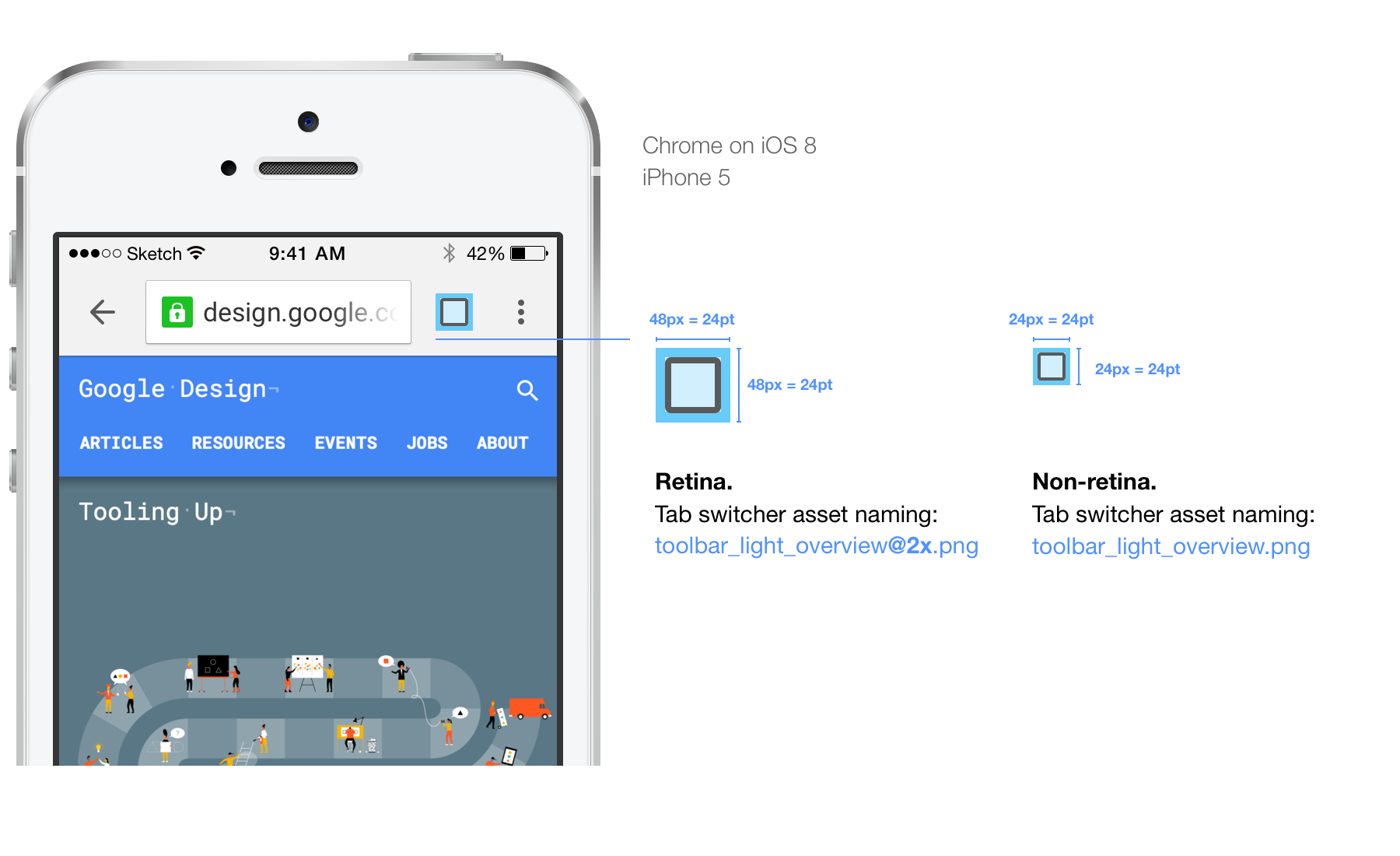
As you can see we need to deliver two images per asset each time. Non-retina images are called name.png. For retina images we append @2x to that to have name@2x.png. This is an iOS convention and it should be followed.
If you create an image that is only going to be used on iPads, we use ~ipad after the .@2x. It is only a Chrome convention. Repeat this process for every asset you need. Never give only one version of an asset; cover every DPI.
Takeaway, iOS ruleset:
- @2x asset must be de double of 1x asset, always.
- Append @2x for retina assets.
- Always create 100% and 200% images.
- Always have the same name for 1x and 2x assets.
- Start designing in 100%, then multiply.
- Deliver .png images.
- Create specs in pt not px.
The Android platform has a wider range of devices than iOS. The reason is that any OEM can build a device and with few restrictions in term of scale and put their own version of Android on it. As a result, you end up with a virtually unlimited variety of screen sizes and DPI, from phones as big as tablets and tablets almost as small as phones. For this reason, your design will always have to adapt.
For this section we're going to take a different approach than for iOS. We'll talk about the multipliers and categories of DPI first.
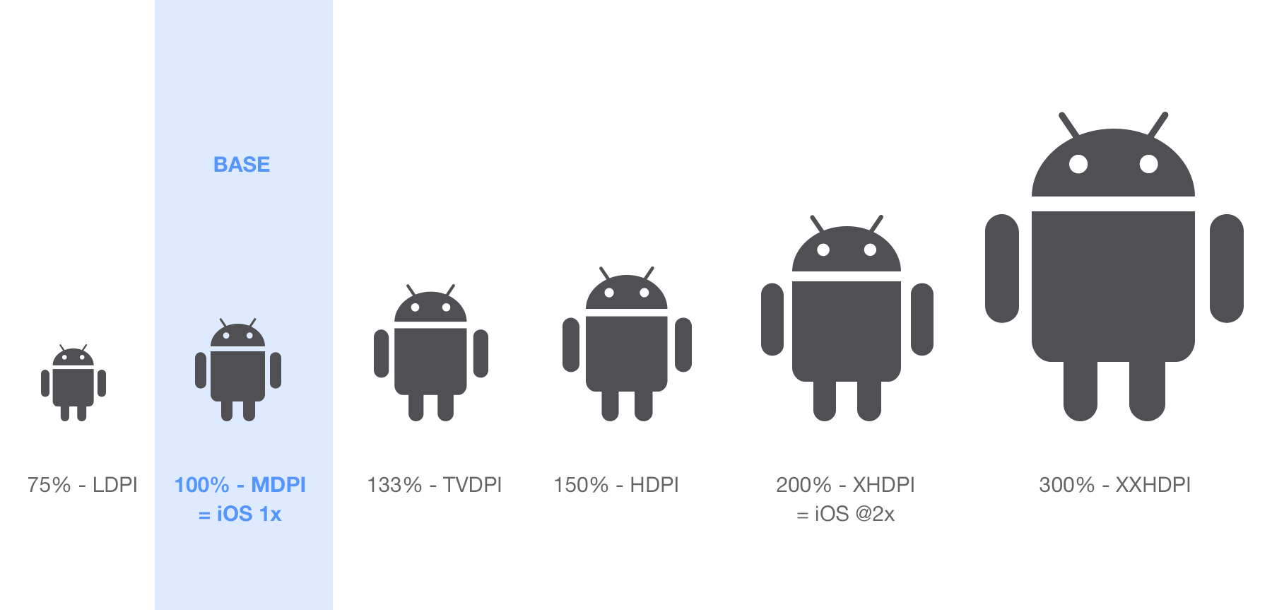
Like for iOS, you have two categories of devices: phones and tablets. Both categories can be arranged in different DPI categories: ldpi, mdpi, tvdpi, hdpi, xhdpi, xxhdpi and xxxhdpi.
Fortunately, some are used more frequently than others, some are even deprecated.
The first thing we have to do is to find the base unit that is the equivalent of the 1x for iOS. On Android, this base is MDPI.
Let's take a look at the multipliers in the cheatsheet below.
Yes, it's a lot, and it's not over. There is one left.
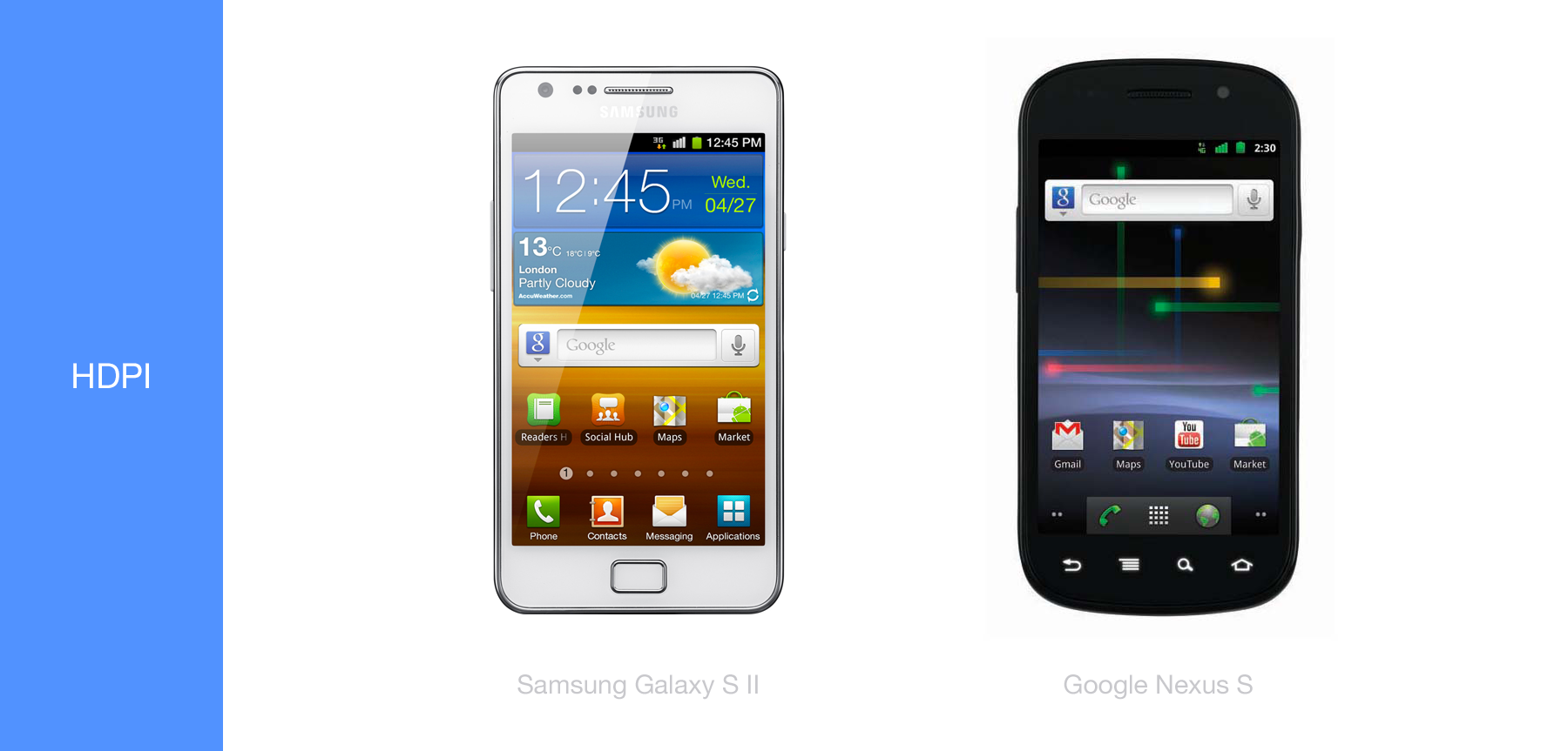
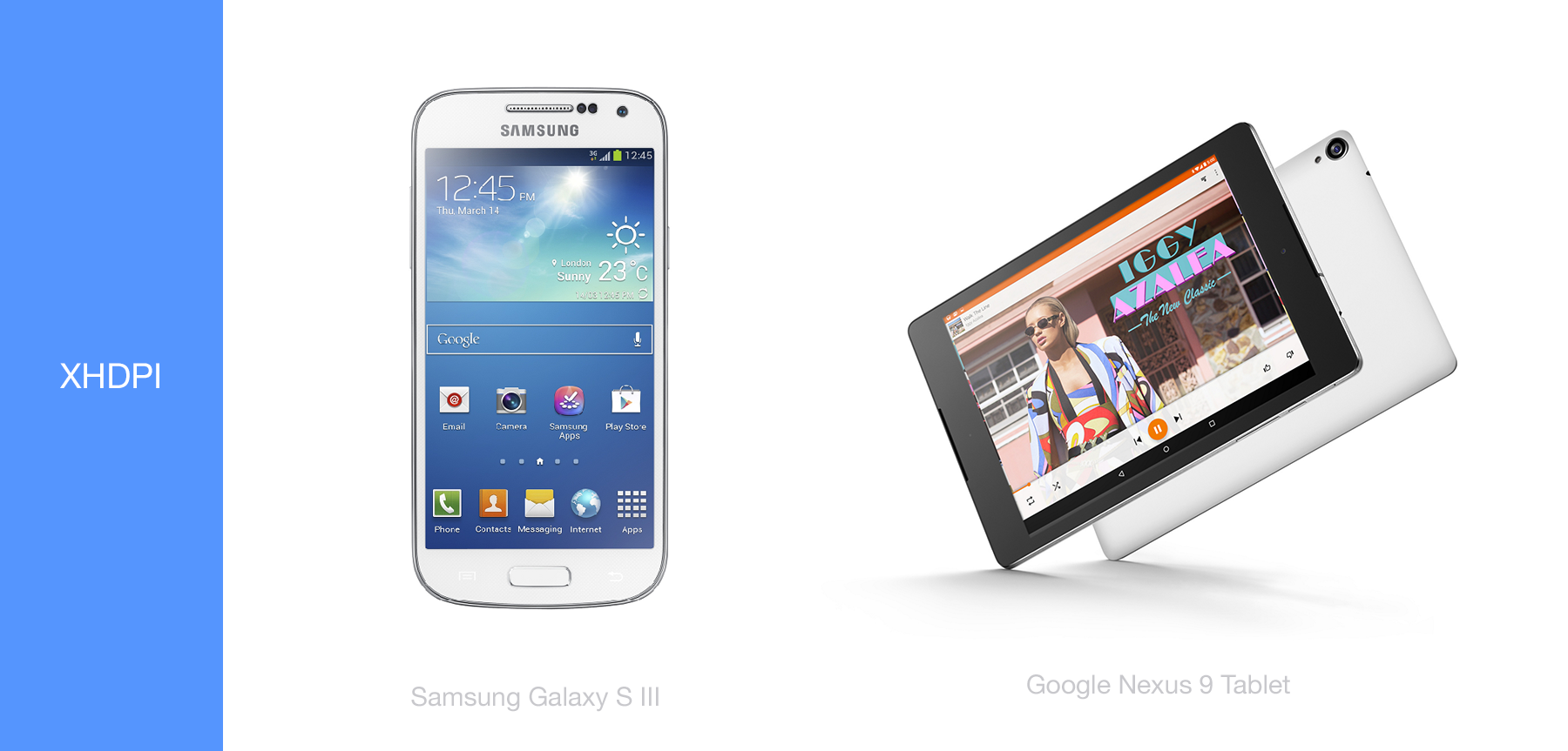
Effectively there is four DPI in use: MDPI, HDPI, XHDPI and XXHDPI.
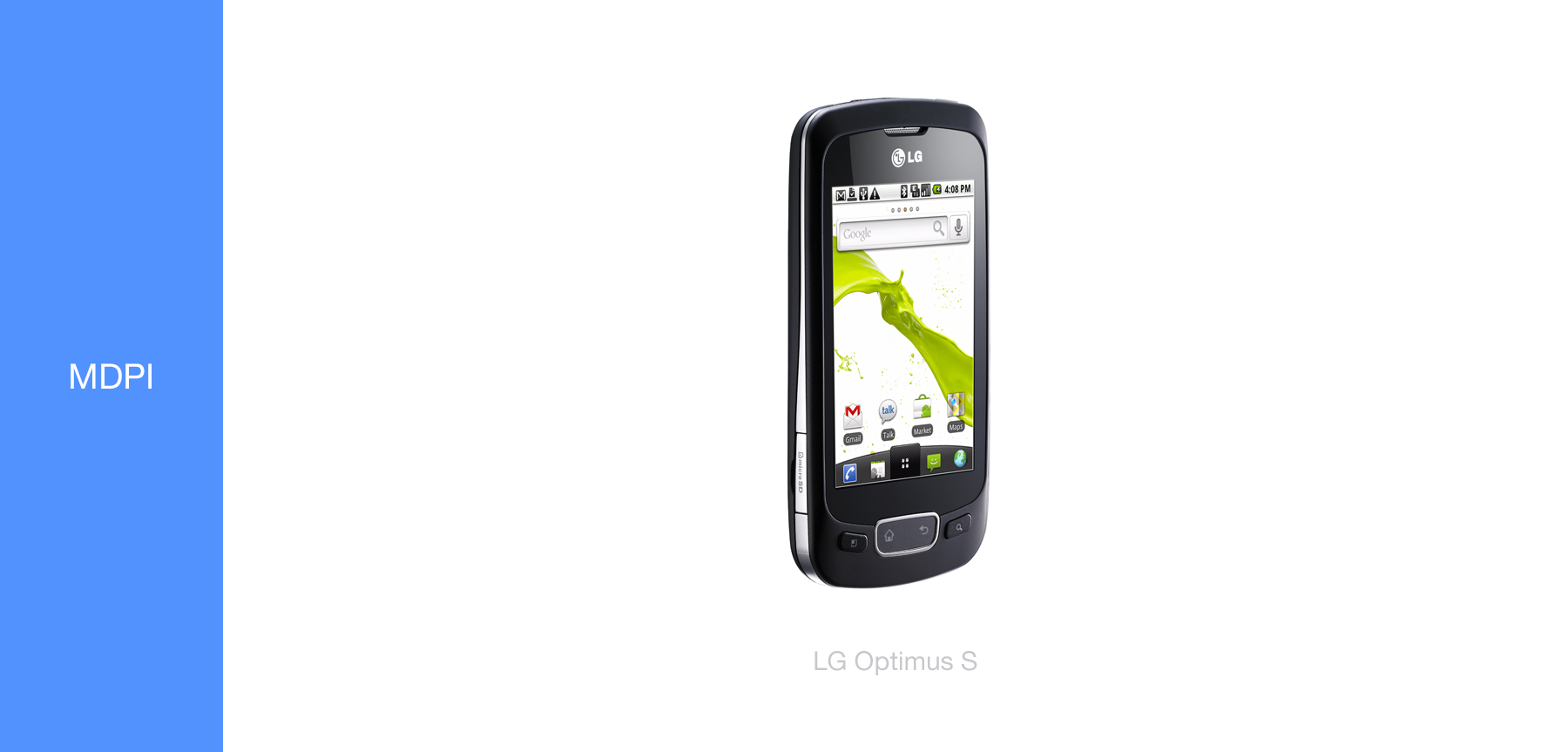
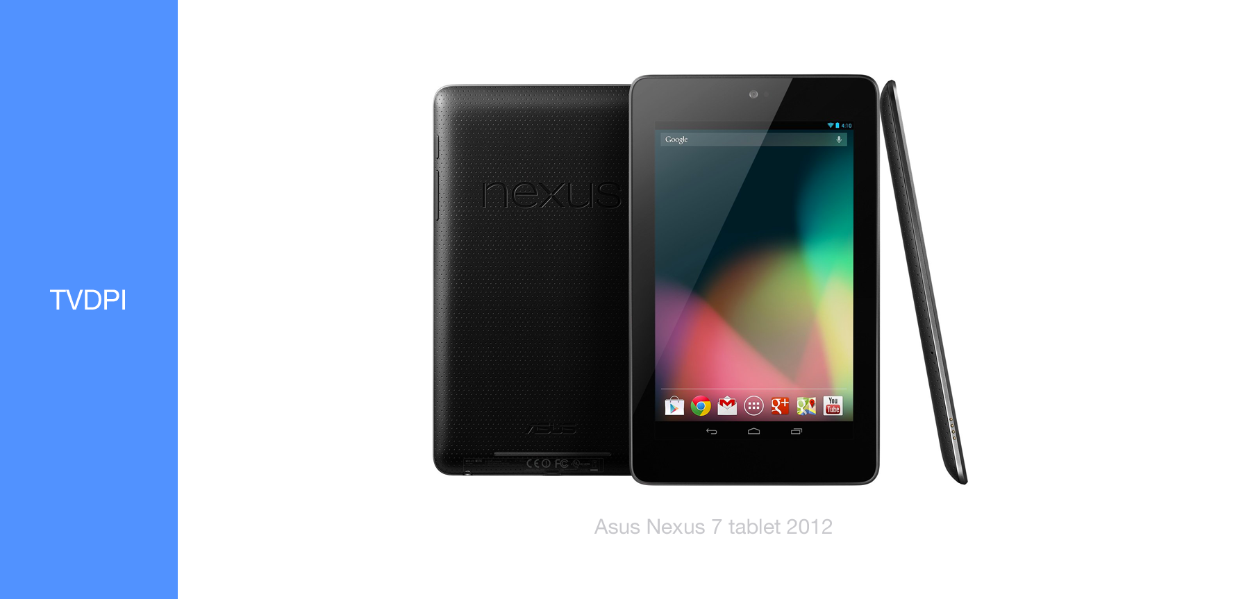
LDPI is an old DPI, not used anymore, TVDPI was a specific case for TV UI and was used briefly for the Nexus 7 2012 edition. It can be considered not necessary for phone and tablet use.
A note though, the TVDPI's multiplier(1.33x) is used in some of Android Wear's devices such as the LG G watch but we'll talk about that later.
Let's put everything in perspective by associating Android phones and tablets with their respective DPI.
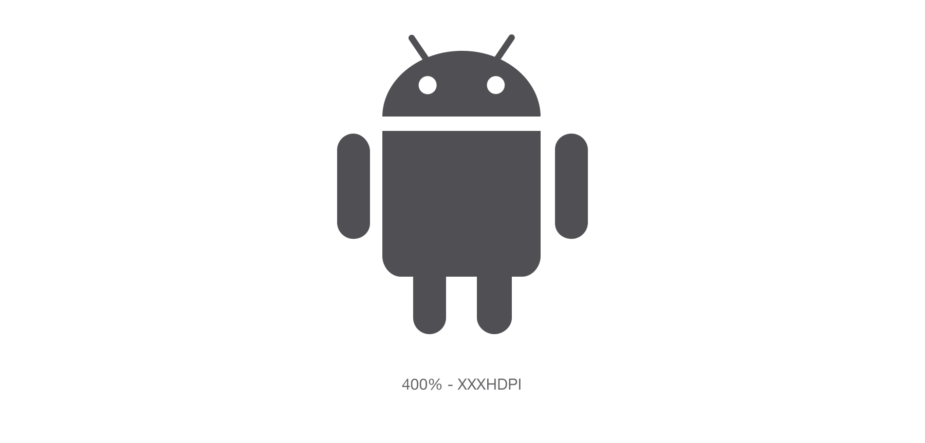
There might be one device using XXXHDPI at the moment for actual app assets, it is still very uncommon but if you can afford the extra time, generating XXXHDPI assets will future-proof your app.
Required Assets, Chrome example.
You are going to have to deliver a set of 4 images per asset, from MDPI to XXHDPI. You can leave LDPI out of the set. Note that in the case of the version of Chrome showed below, TVDPI was exported as well that why the count is 5 images per asset in this specific case.
Just as for iOS, I suggest you take the 100% or 1x multiplier as a base for your design. This makes prepping the design for every other multiplier easier, expecially on Android with multipliers such as 1.33 and 1.5.
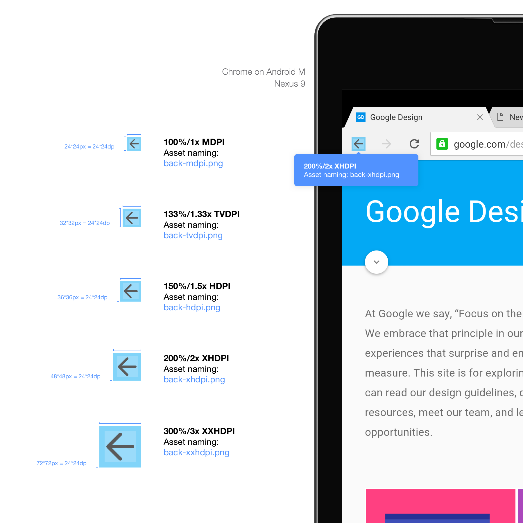
See below for an example Chrome's back button on Android.
The naming suggested here with the appended DPI is not something that is mandatory nor presented in the Android official guidelines. It is the way that we have been naming our assets because of the limitation of the current design tools that make it hard to define a specific path per asset export.
Considering that an asset source can sometimes hold hundreds of assets, it is a way to make the export process less painful and to avoid duplicated names errors on the designer's side. The way that the asset buckets are structured in the source repository will be as followed:
- drawable-mdpi/asset.png
- drawable-hdpi/asset.png
- etc...
As you can see, the asset is cut in a 32*32dp square. The issue with Android multipliers is that some of them use decimals. When you multiply a number by 1.33 or 1.5, chances are you're going to end up with a decimal number. In this case you'll want to round the number to what you think makes sense. In the case of the example, 32*1.33=42.56 so we rounded it up to 43px.
You'll need to be careful for pixel-sized elements such as stroke. you may want to make sure your stroke is either 1px wide or 2px wide and not blurry as described in the screen resolution section.
Takeaway, Android ruleset:
- Android has 7 different DPIs, you need to worry about 4: mdpi,hdpi,xhdpi,xxhdpi plus one if you want to future-proof your app, XXXHDPI
- MDPI is the base DPI or your 1x multiplier
- Android uses dp instead of pt for specs, but they are the same
- Use your best judgment for decimal multipliers.
- Deliver .png images.
- Make sure to validate your naming convention and export process with the person responsible of the implementation.
Mac (OSX) and Chrome OS behave quite the same way in term of PPI handling.
Both OS support regular PPI (100%) and hi-res / retina PPI (200%). Like for the iPhone and iPads, there is only a 2x multiplier.
Even if most of your users, both Mac and Chrome OS will be on low res devices(for now), I highly recommend future proofing your apps for these high-end screens.
Future proofing for ChromeOS means creating hi-res assets for your Web-app or website, which will never be wasted time.
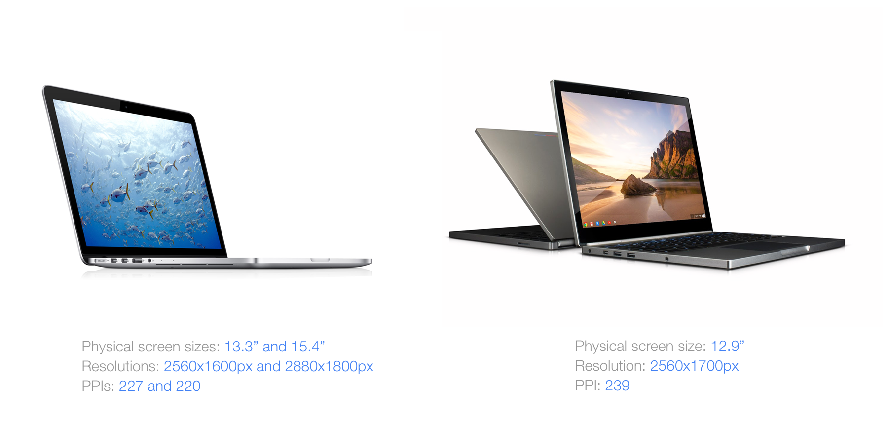
There is currently a total of 3 laptops handling this PPI, the Macbook pro 13", 15" and the Chromebook Pixel. Additionally to this, the Chromebook Pixel handles touch.
Required Assets, Chrome example.
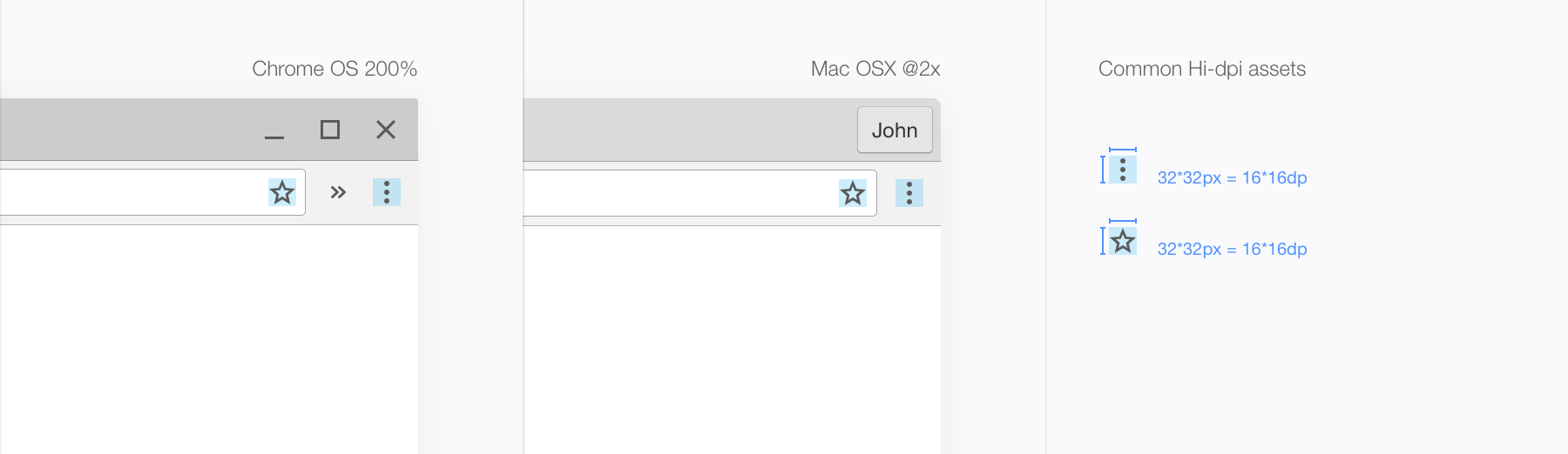
A perfect example of this similarity would be the Chrome toolbar assets button. We use the exact same ones across both platforms. If the code is different, the visuals are the same. See below the Chrome menu button example.
Takeaway:
- Chrome OS and OSX use the same multiplier, 2.
- The only Chrome OS hi-resolution display also handles touch.
Whether your app is on desktop or mobile. You'll almost always require stretchable assets.
A stretchable asset is set up so the code will be able to make it as big as it needs to be without degrading the rendering.
They are different from repeatable assets, which work differently even while sometimes displaying the same result.
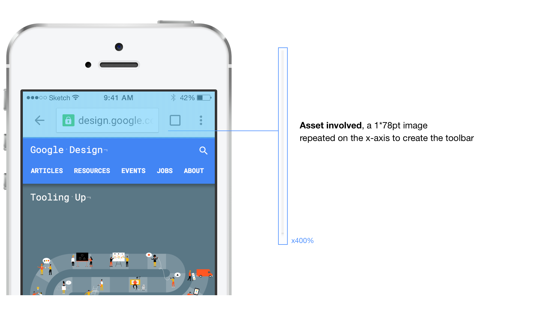
See the Chrome example below. The toolbar on iOS is generated using only one super thin asset that is repeated on the X-axis across the entire screen.
Now that this is out of the way, let's see how different platforms handle stretchable assets.
Stretchable assets on iOS
iOS makes it easy for the designer because the stretch is defined in the code rather that in the way you make your asset slices or markings. All you'll have to do is provide a base image, and - if you're not implementing it yourself - spec this asset as stretchable horizontally, vertically or both. See the example below which is the default Chrome content button on iOS.
Stretchable assets on Android
Android has a different way of doing stretchable assets than iOS. It relies a bit more on the designer.
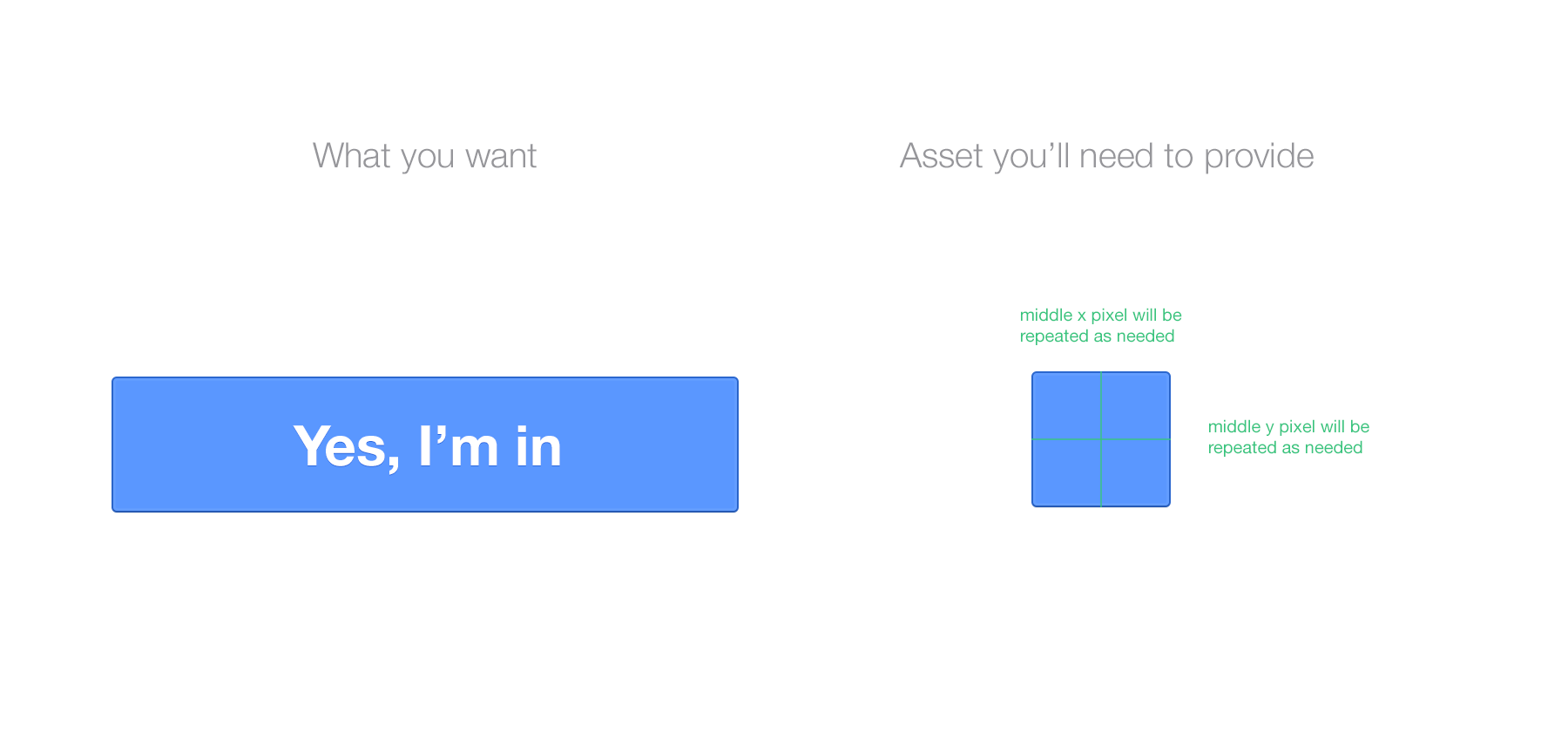
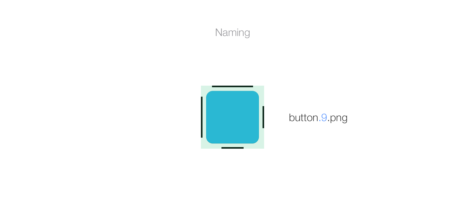
For this platform, you'll be using 9-patch guides. These guides consist of 4 lines surrounding the asset itself. They have to be delivered in the slice/image like it is part of the visual itself, literally visually display its specs within it.
They define two things: the scalable area and the fill area. Once these are defined, the code will only be able to stretch what you defined and put content where you defined it to go.
See the example below, which is the Android version of the default Chrome button you saw earlier. I made it bigger on purpose for the demonstration.
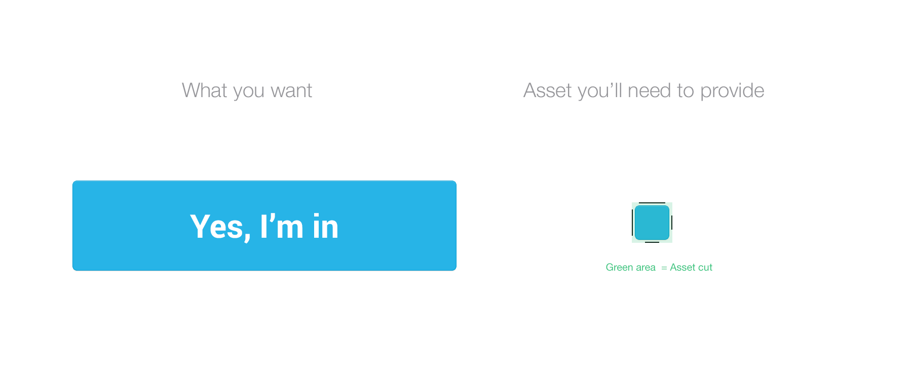
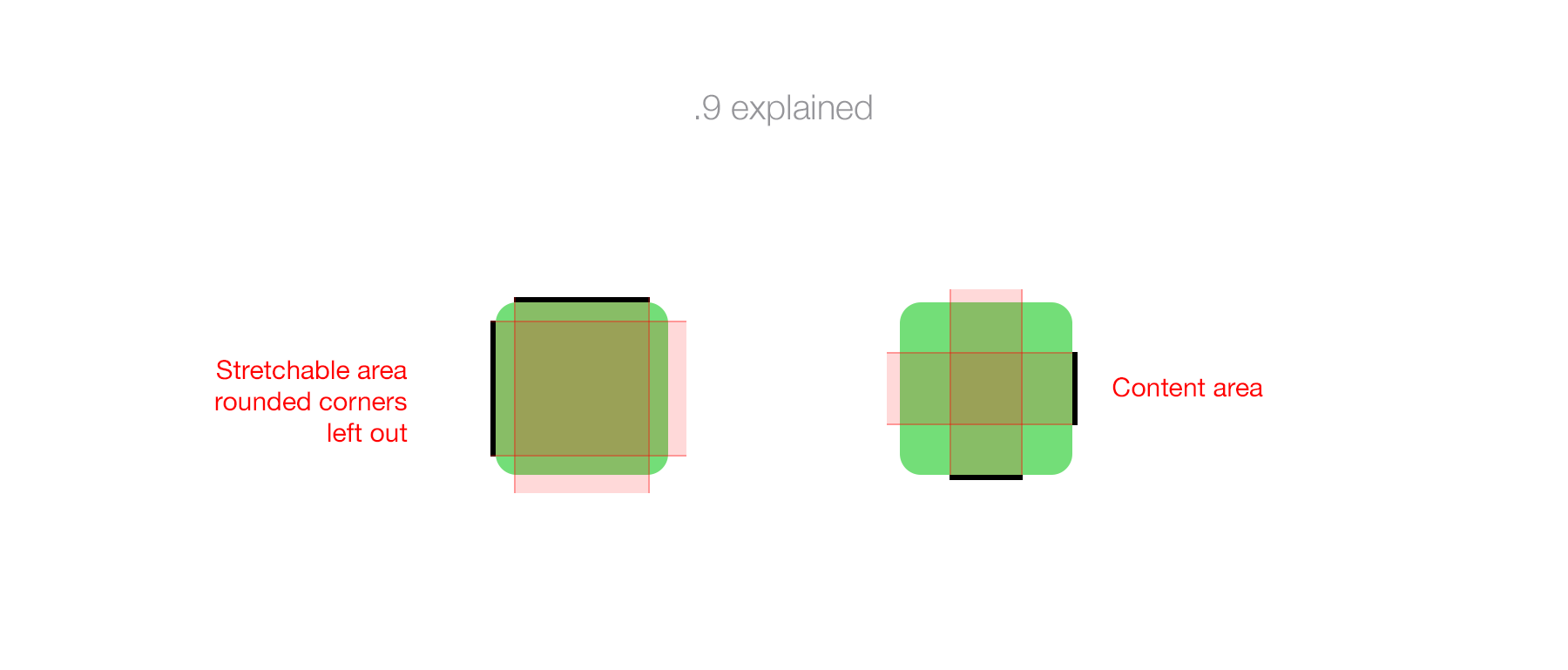
As you can see, the 9-patch is a set of 4 pure #000000 bars. They should have a width of 1px for any DPI; this is a code indication. The stretchable area does not include the rounded corners because it is not something that can be repeated (or it will look terrible.) In this case, we added a 10dp padding for the button. This is something you won't have to spec out. .9 indicators also need to lay and a 100% transparent part of the asset cut. If not, it won't work and require modification.
Using 9-patch requires you to append .9 to the name, the same way you add @2x for iOS assets. Retaking our button asset example below:
Note that you should be careful of the size of your asset. If I made it quite big for demonstration, it is important that you optimize your asset weight by reducing it's size to a minimum, as show below. I kept the corners as they were but reduced the stretchable and content area to a minimum.
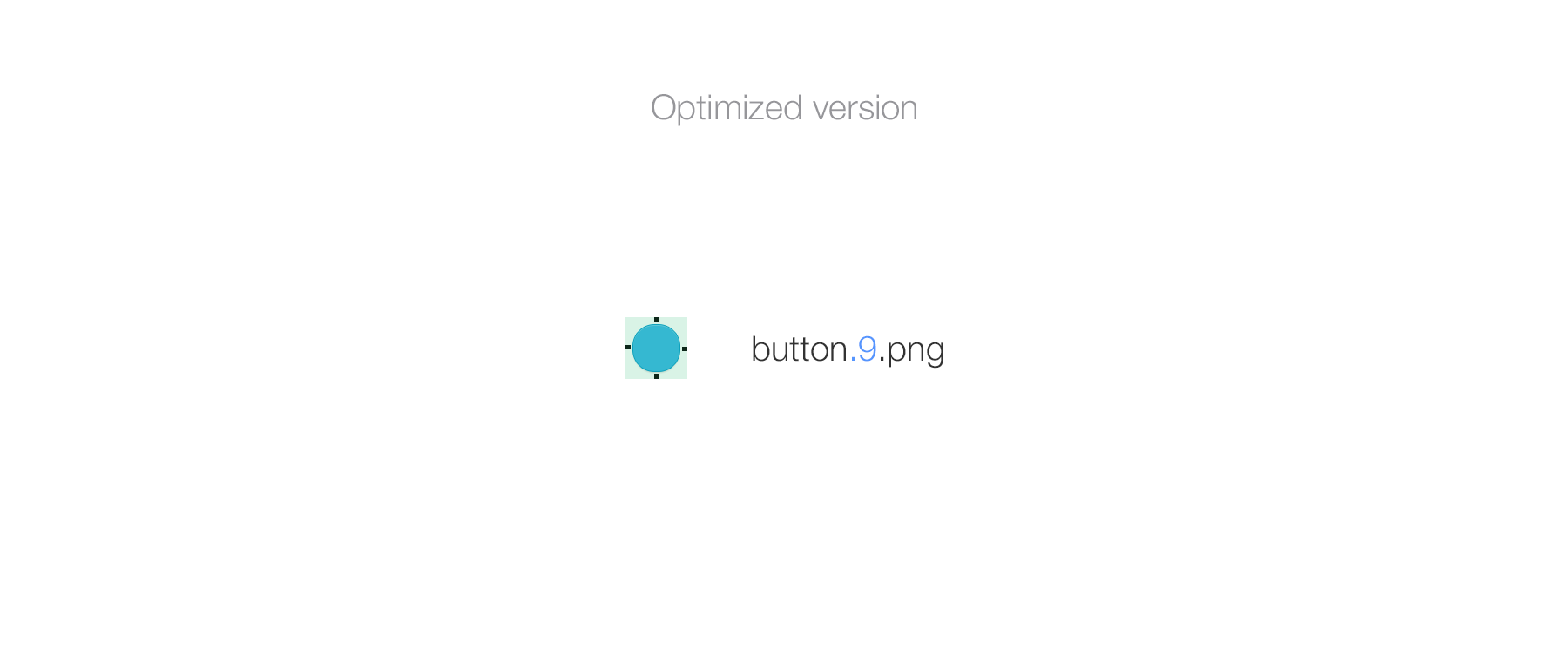
Be careful that the 9-patch markings do not overlap your design and that the cut of the asset is correct. The .9 should be as close to the asset as possible without overlapping it, try not to build-in padding. The example before has built-in padding because of shadowing.
The 9-patch doesn't replace exporting your asset in every DPI. It needs to be done for each version of the asset.
Last thing, a .9 can have multiple stretchable areas (the top and left ones). It's not something I encountered a lot, if not ever in my workflow, but it's worth mentionning.
Takeaway:
Always ask the person implementing your design what's the best solution to adopt, especially for desktop. The more images you'll have, the heavier the app will be, and it will become harder for you to track and update your assets. 9-patch should be used only with good naming and good organization of your sources.
The first thing to understand here is that making something touch ready has nothing to do with DPI. But when it comes to creating a UI or generating assets, it is important to understand the relationship between touch and DPI.
Making the choice between touch or non-touch will highly depend on the scope of your app, where it is going to be deployed and how you want the user experience to be.
Let's split it in simple categories, desktop non-touch and mobile.
Desktop, non-touch
Let's not give a history class here but unless you were born in 2005, you know that the computing technology wasn't created with touch in mind.
We use mouse and keyboard, that are extremely precise tools to navigate a UI. The precision of your mouse cursor is 1pt. You could in theory create a 1x1pt button
that would be clickable by any super-human out there.
See the illustration below.
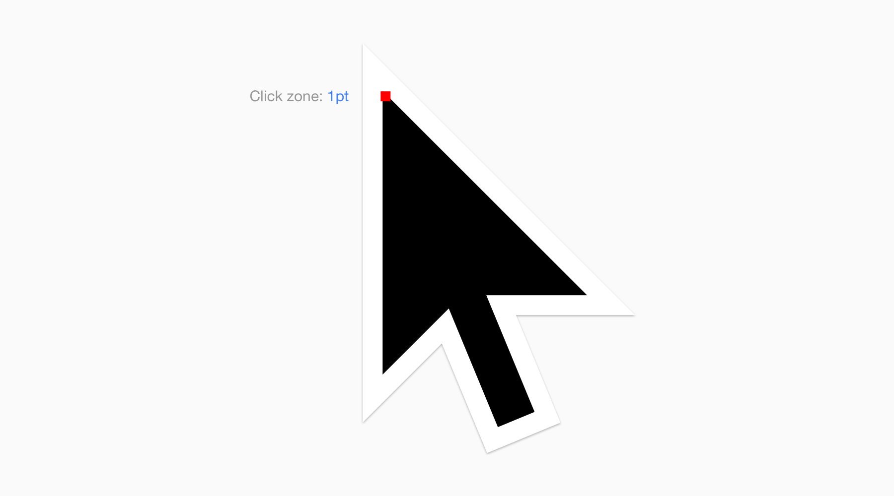
This is a 20x version of the Chrome OS cursor.
The red zoning it the actual area that triggers an action on the UI. Pretty precise.
You know were I'm heading. What's not very precise ? Our fingers.
So how do you design for touch ? Well you make everything bigger.
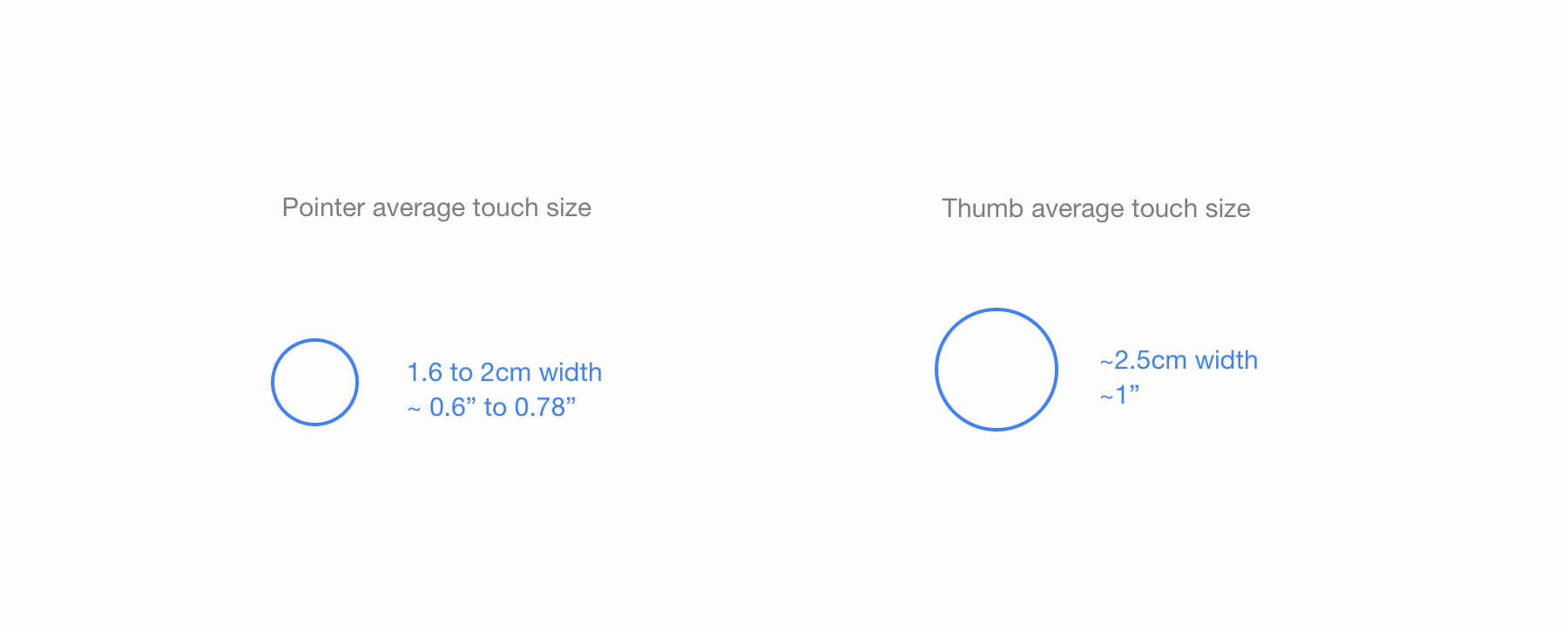
Finger size
Here's the average size of the two most used fingers for UI interaction, the pointer and the thumb. It represents both the touch zone and the the area obstructed by the finger. The actual touch zone (i.e the part of your finger that is in contact with the screen) will of course be smaller and a bit more precise, unless you really smash your finger against the screen.
When designing for touch, it's safer to overestimate the size needed for touch targets than underestimate them.
How to apply this to my design flow
As we already saw, inches or cm are not the best way to count in a pixel world. Matter of fact, even pixel is not a really good way to count.
So how do you make sure your design is touch ready ?
I'm going to state the obvious but you should always try your design on the targeted devices/platform.
But to avoid losing too much time, there is some base pixel-based sizes that are considered safe to use and that are recommended on an per OS basis.
Recommended touch targets per platform
Again, careful, these sizes are for convenience and are not a unit of real life size measurement whatsoever. They work because OEM and manufacturers are following guidelines to make screens consistent in term of size/dpi ratio.
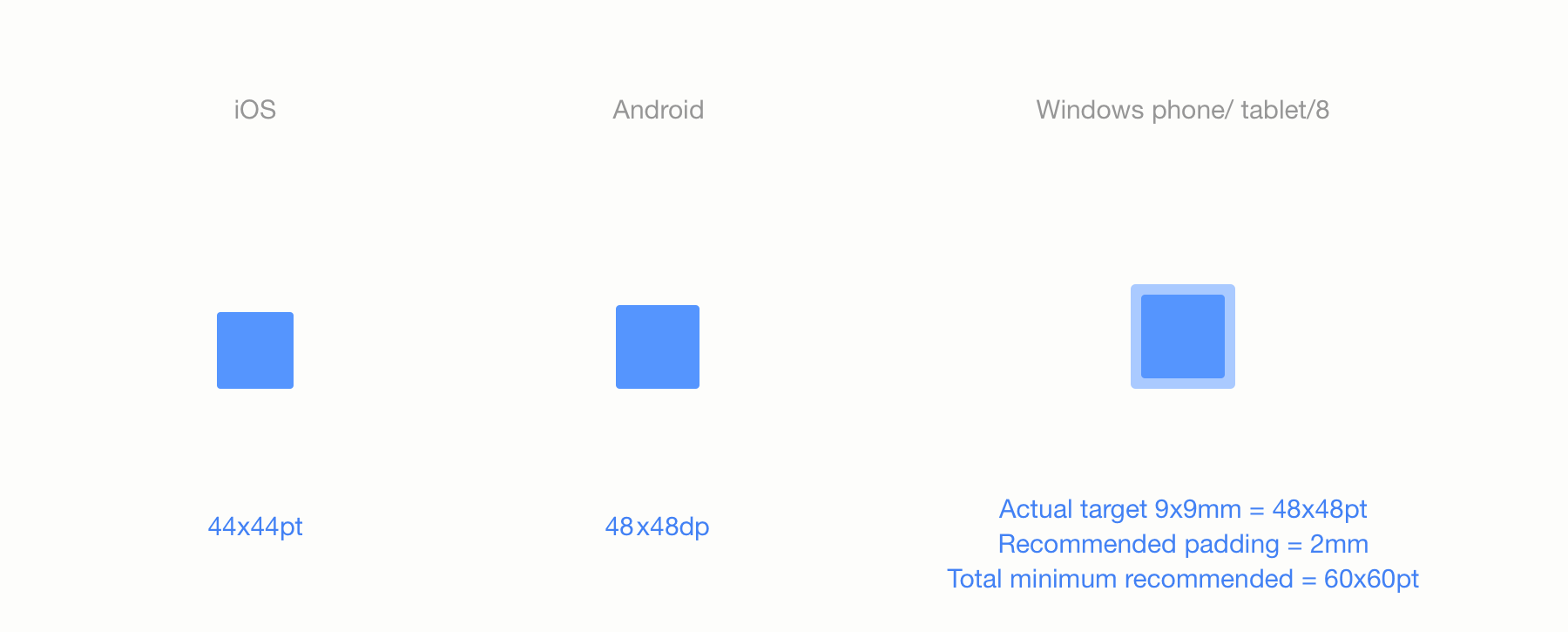
As you can see each OS has its own set of recommendations but they are all around the 48pt. Windows includes the padding in its specs, that's why I added it here.
The difference in these sizes comes from different factors.
Apple controls its hardware so they know the quality of the touch screen and control the exact ratio. They can rely on a smaller
touch target. Additionaly, their hardware tends to be physically smaller.
Android and Windows on the other hand have different OEMs, each building its own hardware, having bigger touch targets makes them "safer". Their UI is also more spaced out (especially windows) and their devices tends to be physically bigger.
The chrome example
Here's how Chrome applies this. The coded touch targets appear in blue.
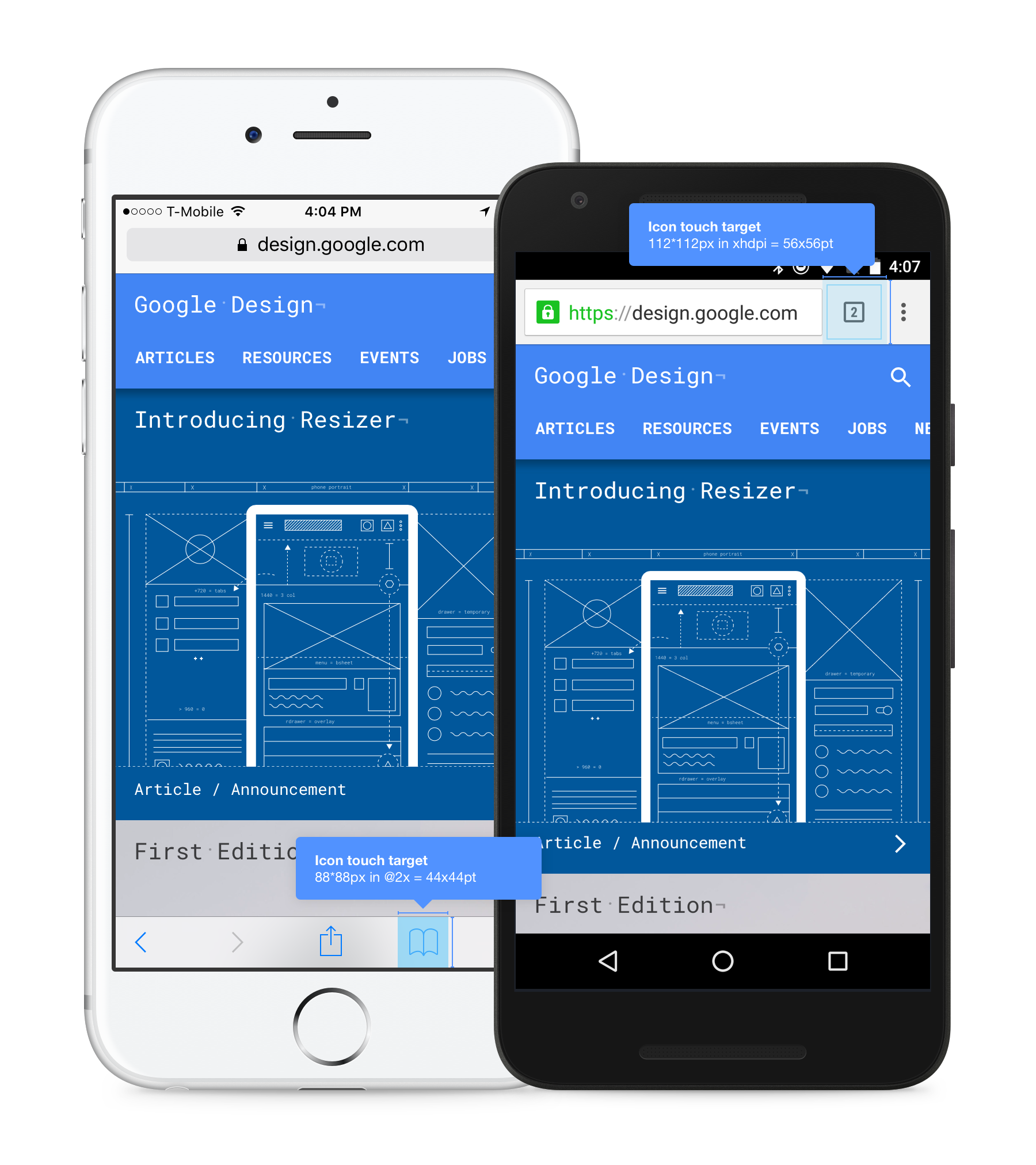
As you can see, both toolbars are the recommended touch target height for each platform. Also the area surrounding the visual is a 44x44pt and 48x48pt square for iOS and Android respectively. Not only this makes the UI consistent with the rest of the OS in term of sizing but it's a great way for you to have a minimum size for everything you want the user to interact with.
Windows 8 And Chrome OS
Windows 8 and Chrome OS supports both touch and non-touch interfaces. If you design for a Windows 8 app, I'd highly recommend following their guidelines for touch targets.
Chrome OS guidelines has yet to be released but and the Pixel usage it not big. However, since all Chrome OS apps are web based, I'd suggest designing to touch anyway. My recommendation would be to apply the Android touch targets guidelines.
The web, hybrid devices and the future.
If you're designing for mobile, it will be clear what decision to make, go touch. If you're designing for desktop, go non-touch. It sounds easy but it'd be ignoring a new tendency that arrises, hybrid devices.
An hybrid device is a device that supposedly does both touch and non-touch. The Chromebook Pixel, the Surface Pro and the Lenovo Yoga are a good example.
What to do in this case ? Well there is no easy answer but I'm going to go ahead and give one, go for touch. That's where the technology is going to evolve.
If you design for the web, or anything for that matter, think touch upfront.
Takeaway:
- Think mobile, think touch in almost everything you'll do in the future.
- Use recommended touch targets for each OS. This will help make your design better and help you reach consistency within the OS.
- Touch targets are reference values, it doesn't mean you should follow them to the letter. Ultimately, you control the experience.
The software doesn't make the designer, but choosing the right software for the task at hand can improve your productivity and ease of work by quite a bit. Software "know-hows" shouldn't be your only skill but learning and mastering the right tool will be a great asset to make your ideas happen.
When it comes to handling DPI variation in interface design, different software work in different ways. Some are better at particular tasks than others. Here are the most common:
Photoshop
The mother of interface design tools. Probably the most used tool out there today. There is an infinite amount or resources, tutorials, articles for it. Photoshop has been around almost since the beginning of interface design.
As its name suggests, the first intention of the program wasn't interface design but photo or bitmap retouching. It evolved over the year and with the birth of interface design, designers appropriated it and re-purposed it. Part of this was because they were used to it and because it was the only program around that was able to do things as good as needed.
Photoshop is, to this day, the master of Bitmap editing and is still the most used program out there for UI design. Its decades long legacy makes it a hard program to approach and learn though. As a gigantic swiss army knife of a software, you'll be able to do anything, but not always in the most efficient way.
As it it bitmap based initially, it is DPI dependent, the opposite of Illustrator and Sketch described below.
Illustrator
Photoshop's vector based sibling. As its name indicates, it is aimed at Illustrators but it is also usable as an interface design tool.
Illustrator is suited for print design as well so its interface, color management, scale, rulers and units may throw you off at first and it requires a few tweaks to be easily usable for interface design only. Like Photoshop, it is an incredibly powerful tool with a steep learning curve.
What differs from Photoshop is that it is DPI independent due to its reliance on vector shapes. Contrary to bitmap or raster images, graphics made using vector shapes, relying on mathematical formulas, will be rescaled programmatically without any quality loss.
Understanding the difference between rasterized and vectorized image is key to build scalable visual design and assets.
If you want to get started with using Illustrator for web/interface design, I recommend reading "My vector workflow" by @janoskoos.
Sketch 3.0
Sketch is new compared to Photoshop and Illustrator. With only 4 years of age, this program generated a lot of hype (in a good way) in the UI designer industry. The reason is that Sketch is aimed, from the start, to be used by interface and UX designers. Without the legacy of Photoshop or Illustrator, Sketch positions itself as the perfectly adapted tool for the niche audience that is interface designers.
Sketch is suited for fast wireframing as well as more complex visual design. It is entirely vector based, like Illustrator, with a minimal and well thought UI. The combination of artboards and the ease of use and flexibility of its asset generation system makes it the fastest tool for multi-DPI and multi-platform design. The recent release of its 3.0 version make it a very solid alternative to Photoshop.
On the downside, Sketch is supported by a smaller team and is still fairly recent. Its team is extremely reactive but doesn't have the scale of the Adobe (Photoshop and Illustrator) one. Sketch offers (by design) the bear minimum when it comes to bitmap edition. Photoshop will be more suited for this kind of job. Finally, due to its fairly still young life, the resources in term of source files, tutorials and overall community is orders of magnitude smaller than Photoshop. That being said, the community is very active and motivated.
On a more personal note, I've been a Photoshop user since I started design 8 years ago but I recently switch to Sketch 3.0 for the most part of my design process. This is not a judgement of quality, Photoshop is still a hell of a good program, it just suits my needs better.
If you want to learn more on my particular experience I encourage you to read my "A month with Sketch 3.0" article or my "Sketch tutorial_01".
Want to get even deeper and understand how vectors work in sketch ? Head to @pnowelldesign's article "Harnessing vector awesomeness in Sketch"
Takeaway:
There is no perfect tool for the job but the one you are comfortable using. If you can afford the time an money, I recommend you try them all to make up your own opinion.

I'm Sebastien Gabriel aka @Kounterb and I'm a visual designer for @googlechrome. I like to write things and create freebies.
One thing I wish I had when I started is a clear guide explaining to me what DPI is and what the challenges of multi-platform design were going to be. This is what I'm trying to do here. By designing Chrome for almost every platforms out there, I learned a lot about these subjects and this is my effort to try and deliver it in the simplest way possible. As mentionned in the intro, if you think I got anything wrong, if anything lacks detail or if you would like to learn more about something, send me a message at sgabriel.contact@gmail.com.