7 Things You Didn't Know You Could Do with CSS

CSS and JavaScript, believe it or not, are starting to overlap as CSS adds more functionality. When I wrote 5 Ways that CSS and JavaScript Interact That You May Not Know About, people were surprised at how CSS and JavaScript have come to overlap. Today I will highlight seven tasks you can accomplish with CSS -- no JavaScript or imagery required!
Every good front-end developer feature-tests before using features which a browser may not have. Feature testing has always done with JavaScript, and many people use Modernizr, an impressive utility packed with loads of well-tested routines, to do that feature testing. A new API, however, has come along to let you do feature tests with CSS: @supports. Here are a few samples of how @supports works:
/* basic usage */
@supports(prop:value) {
	/* more styles */
}

/* real usage */
@supports (display: flex) {
	div { display: flex; }
}

/* testing prefixes too */
@supports (display: -webkit-flex) or
          (display: -moz-flex) or
          (display: flex) {

    section {
      display: -webkit-flex;
      display: -moz-flex;
    	display: flex;
    	float: none;
    }
}
This new @supports feature, which also has a JavaScript counterpart, is well overdue and we can look forward to using it soon!
Write a service to modify an image's color shades and you can sell it to Facebook for a billion dollars! Of course that's an over-simplification but writing image filters isn't exactly a science. I wrote a tiny app my first week at Mozilla (which won a contest, BTW...just sayin') which used some JS-based math to create image filters with canvas, but today we can create image filters with just CSS!
/* simple filter */
.myElement {
	-webkit-filter: blur(2px);
}

/* advanced filter */
.myElement {
	-webkit-filter: blur(2px) grayscale (.5) opacity(0.8) hue-rotate(120deg);
}
This type of filtering only masks an image's original view and doesn't save or export the image with said filter, but it's great for photo galleries or anywhere else you'd like to add flare to an image!
The CSS pointer-events property provides a method to effectively disable an element, so much so that clicks on a link don't trigger a click event through JavaScript:
/* do nothing when clicked or activated */
.disabled { pointer-events: none; }
/* this will _not_ fire because of the pointer-events: none application */
document.getElementById("disabled-element").addEventListener("click", function(e) {
	alert("Clicked!");
});
In the example above, the click event wont even fire due to the CSS pointer-events value. I find this of massive utility as you don't need to do className or attribute checks everywhere to see if something is disabled.
CSS affords us the ability to create transitions and animations but oftentimes we need JavaScript libraries to give us a hand in modifying a few things and controlling the animation. One such popular animation is the slide up and slide down effect, which most people don't know can be accomplished with only CSS!
/* slider in open state */
.slider {
	overflow-y: hidden;
	max-height: 500px; /* approximate max height */

	transition-property: all;
	transition-duration: .5s;
	transition-timing-function: cubic-bezier(0, 1, 0.5, 1);
}

/* close it with the "closed" class */
.slider.closed {
	max-height: 0;
}
A clever use of max-height allows the element to grow and shrink as needed.
We'll always have a giggle at what the term "counter" means on the internet, but CSS counters are another thing entirely. CSS counters allow developers to increment a counter and display it via :before or :after for a given element:
/* initialize the counter */
ol.slides {
	counter-reset: slideNum;
}

/* increment the counter */
ol.slides > li {
	counter-increment: slideNum;
}

/* display the counter value */
ol.slides li:after {
	content: "[" counter(slideNum) "]";
}
You often see CSS counters used in slideshows at conferences and even in lists like a table of contents.
There are loads of CSS best practice documents out there, and they'll all start with how to name your CSS classes. What you'll never see is one of those documents telling you to use unicode symbols to name your classes:
.ಠ_ಠ {
	border: 1px solid #f00;
	background: pink;
}

.❤ {
	background: lightgreen;
	border: 1px solid green;
}
Please don't use these. Please. BUT YOU CAN!
CSS triangles are a neat trick but so are CSS circles. By abusing CSS border-radius, you can create flawless circles!
.circle {
	border-radius: 50%;
	width: 200px;
	height: 200px;
	/* width and height can be anything, as long as they're equal */
}
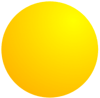
You can add gradients to your circles and you can even use CSS animations to spin them around! CSS has a more uniform API for Shapes coming but you can create circles with this hack now!
There you have it: seven things you can do with CSS that you may be surprised at. A few are quite useful, a few are more edge cases. Let me know if I've missed an awesome CSS task that you use frequently!